Every website needs a button. This documentation gives an overview of the “Button” presets that come with ska-theme, provides copy-pastable examples of basic and advanced buttons and details about their usage in various contexts.
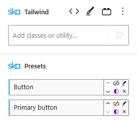
When using ska-theme you can create a button from anything by adding the Button preset to a block:
<!-- wp:ska/text {"skaBlocks":{"p":[{"id":"ska-theme--button","isStatic":true}],"t":1758876679},"skaBlocksAs":{"element":"a","href":"#"}} -->
<a href="#" class="wp-block-ska-text ska-text">Neutral button</a>
<!-- /wp:ska/text -->
Adding the Primary button preset alongside the Button preset produces a primary button:
<!-- wp:ska/text {"skaBlocks":{"p":[{"id":"ska-theme--button","isStatic":true},{"id":"ska-theme--primary-button","isStatic":true}],"t":1758876679},"skaBlocksAs":{"element":"a","href":"#"}} -->
<a href="#" class="wp-block-ska-text ska-text">Primary button</a>
<!-- /wp:ska/text -->
Button presets are automatically applied to WordPress buttons (.wp-element-button) in various locations, including the “Button” blocks in “Buttons” block:
<!-- wp:buttons {"skaBlocks":{"cx":"items-stretch","css":".items-stretch{align-items:stretch}","t":1758876679},"skaBlocksAlignItems":{"v":{"$":{"@":"stretch"}}},"layout":{"type":"flex","verticalAlignment":"stretch"}} -->
<div class="items-stretch wp-block-buttons">
<!-- wp:button -->
<div class="wp-block-button"><a class="wp-block-button__link wp-element-button" href="#">WP button - Default</a></div>
<!-- /wp:button -->
<!-- wp:button {"className":"is-style-outline"} -->
<div class="wp-block-button is-style-outline"><a class="wp-block-button__link wp-element-button" href="#">WP button - Outline</a></div>
<!-- /wp:button -->
<!-- wp:button {"className":"is-style-ska-neutral"} -->
<div class="wp-block-button is-style-ska-neutral"><a class="wp-block-button__link wp-element-button" href="#">WP button - Neutral</a></div>
<!-- /wp:button -->
</div>
<!-- /wp:buttons -->
By default the Button preset is set up to use CSS variables for its’ colors (--fg: foreground (text) color, --bg: background color and --accent: focus ring color).
| Variable | Purpose |
|---|---|
--fg | Foreground – text and icons color |
--fg-hover | Foreground color on hover |
--fg-active | Foreground color on active |
--bg | Background color |
--bg-hover | Background color on hover |
--bg-active | Background color on active |
--accent | Ring color on focus |
--icon-size | Default icon size |
Using the variables, the Primary button preset simply overrides them to produce a button with a different appearance ([--fg:var(--color-site-inverted)] [--bg:var(--color-primary)] [--accent:var(--color-primary)]). Hover and active variables use CSS color-mix() to lighten and darken the --fg and --bg variable values, so they don’t need to be overridden in all cases.
The complementing preset should come after the base preset, otherwise neutral button styles will take precedence:
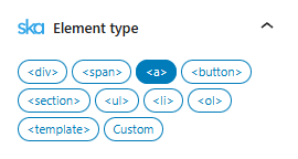
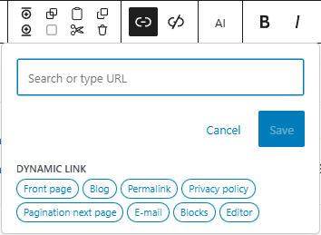
Buttons can be <a> elements, <button> elements or anything else. To add a link to a button change the Element type to <a> and add a link from the toolbar:
Only <a> elements that have a link (href) use the “Pointer” cursor by default but you can change the Tailwind class ([&:is(a[href])]:cursor-pointer) in the Button preset if you don’t agree with this best practice.
Button types
Adding the Outline button preset instead of the Primary button preset will produce an outline button:
<!-- wp:ska/text {"skaBlocks":{"p":[{"id":"ska-theme--button","isStatic":true},{"id":"ska-theme--outline-button","isStatic":true}],"t":1758876679},"skaBlocksAs":{"element":"a","href":"#"}} -->
<a href="#" class="wp-block-ska-text ska-text">Outline button</a>
<!-- /wp:ska/text -->
The outline width can be changed by modifying (or overriding) inset-ring-2 to inset-ring-1, (below example includes font-light rounded-3xl [corner-shape:squircle] as well):
<!-- wp:ska/text {"skaBlocks":{"cx":"[corner-shape:squircle] font-light rounded-3xl inset-ring-1","css":".\u005c[corner-shape\u005c:squircle\u005c]{corner-shape:squircle}.font-light{--tw-font-weight:var(--font-weight-light);font-weight:var(--font-weight-light)}.rounded-3xl{border-radius:var(--radius-3xl)}.inset-ring-1{--tw-inset-ring-shadow:inset 0 0 0 1px var(--tw-inset-ring-color,currentcolor);box-shadow:var(--tw-inset-shadow),var(--tw-inset-ring-shadow),var(--tw-ring-offset-shadow),var(--tw-ring-shadow),var(--tw-shadow)}","t":1758876679,"p":[{"id":"ska-theme--button","isStatic":true},{"id":"ska-theme--outline-button","isStatic":true}]},"skaBlocksAs":{"element":"a","href":"#"},"skaBlocksVariables":{"record":{"corner-shape":{"value":"squircle","type":""}}},"skaBlocksFontWeight":{"v":{"$":{"@":"light"}}},"skaBlocksBorderRadius":{"v":{"$":{"@":"3xl"}}},"skaBlocksInsetRingWidth":{"v":{"$":{"@":"1"}}}} -->
<a href="#" class="[corner-shape:squircle] font-light rounded-3xl inset-ring-1 wp-block-ska-text ska-text">Outline button</a>
<!-- /wp:ska/text -->
A disabled button uses the “not-allowed” cursor and reduced opacity.
<!-- wp:ska/text {"skaBlocks":{"p":[{"id":"ska-theme--button","isStatic":true}],"t":1758876679},"skaBlocksAs":{"href":"","element":"button"},"skaBlocksAttributes":{"record":{"disabled":"disabled"}}} -->
<button disabled class="wp-block-ska-text ska-text">Disabled button</button>
<!-- /wp:ska/text -->
Using bg-transparent! border-transparent! hover:underline on a neutral button can produce a link button:
<!-- wp:ska/text {"skaBlocks":{"cx":"hover:underline bg-transparent! border-transparent!","css":"@media (hover:hover){.hover\u005c:underline:hover{text-decoration-line:underline}}.bg-transparent\u005c!{background-color:#0000!important}.border-transparent\u005c!{border-color:#0000!important}","t":1758876679,"p":[{"id":"ska-theme--button","isStatic":true}]},"skaBlocksAs":{"element":"a","href":"#"},"skaBlocksTextDecoration":{"v":{"$":{"@":""},"hover":{"@":"underline"}}},"skaBlocksBackgroundColor":{"v":{"$":{"@":"transparent!"}}},"skaBlocksBorderColor":{"v":{"$":{"@":"transparent!"}}}} -->
<a href="#" class="hover:underline bg-transparent! border-transparent! wp-block-ska-text ska-text">Link button</a>
<!-- /wp:ska/text -->
The rounded-full class can produce a circular button:
<!-- wp:ska/text {"skaBlocks":{"cx":"rounded-full","css":".rounded-full{border-radius:3.40282e38px}","t":1758876679,"p":[{"id":"ska-theme--button","isStatic":true},{"id":"ska-theme--primary-button","isStatic":true}]},"skaBlocksAs":{"element":"a","href":"#"},"skaBlocksBorderRadius":{"v":{"$":{"@":"full"}}}} -->
<a href="#" class="rounded-full wp-block-ska-text ska-text">Primary pill button</a>
<!-- /wp:ska/text -->
Custom buttons can easily be whipped up on demand (optionally as reusable presets and variations), such as:
<!-- wp:ska/text {"skaBlocks":{"cx":"[--fg:var(--color-site-inverted)] [--bg:var(--color-positive)] [--accent:var(--color-positive)]","css":".\u005c[--fg\u005c:var\u005c(--color-site-inverted\u005c)\u005c]{--fg:var(--color-site-inverted)}.\u005c[--bg\u005c:var\u005c(--color-positive\u005c)\u005c]{--bg:var(--color-positive)}.\u005c[--accent\u005c:var\u005c(--color-positive\u005c)\u005c]{--accent:var(--color-positive)}","t":1758876679,"p":[{"id":"ska-theme--button","isStatic":true}]},"skaBlocksAs":{"element":"a","href":"#"},"skaBlocksVariables":{"record":{"--fg":{"value":"var(--color-site-inverted)","type":"color"},"--bg":{"value":"var(--color-positive)","type":"color"},"--accent":{"value":"var(--color-positive)","type":"color"}}}} -->
<a href="#" class="[--fg:var(--color-site-inverted)] [--bg:var(--color-positive)] [--accent:var(--color-positive)] wp-block-ska-text ska-text">Positive button</a>
<!-- /wp:ska/text --><!-- wp:ska/text {"skaBlocks":{"cx":"[--fg:var(--color-site-inverted)] [--bg:var(--color-negative)] [--accent:var(--color-negative)]","css":".\u005c[--fg\u005c:var\u005c(--color-site-inverted\u005c)\u005c]{--fg:var(--color-site-inverted)}.\u005c[--bg\u005c:var\u005c(--color-negative\u005c)\u005c]{--bg:var(--color-negative)}.\u005c[--accent\u005c:var\u005c(--color-negative\u005c)\u005c]{--accent:var(--color-negative)}","t":1758876679,"p":[{"id":"ska-theme--button","isStatic":true}]},"skaBlocksAs":{"element":"a","href":"#"},"skaBlocksVariables":{"record":{"--fg":{"value":"var(--color-site-inverted)","type":"color"},"--bg":{"value":"var(--color-negative)","type":"color"},"--accent":{"value":"var(--color-negative)","type":"color"}}}} -->
<a href="#" class="[--fg:var(--color-site-inverted)] [--bg:var(--color-negative)] [--accent:var(--color-negative)] wp-block-ska-text ska-text">Negative button</a>
<!-- /wp:ska/text --><!-- wp:ska/text {"skaBlocks":{"cx":"[--fg:var(--color-site-inverted)] [--bg:var(--color-warning)] [--accent:var(--color-warning)]","css":".\u005c[--fg\u005c:var\u005c(--color-site-inverted\u005c)\u005c]{--fg:var(--color-site-inverted)}.\u005c[--bg\u005c:var\u005c(--color-warning\u005c)\u005c]{--bg:var(--color-warning)}.\u005c[--accent\u005c:var\u005c(--color-warning\u005c)\u005c]{--accent:var(--color-warning)}","t":1758876679,"p":[{"id":"ska-theme--button","isStatic":true}]},"skaBlocksAs":{"element":"a","href":"#"},"skaBlocksVariables":{"record":{"--fg":{"value":"var(--color-site-inverted)","type":"color"},"--bg":{"value":"var(--color-warning)","type":"color"},"--accent":{"value":"var(--color-warning)","type":"color"}}}} -->
<a href="#" class="[--fg:var(--color-site-inverted)] [--bg:var(--color-warning)] [--accent:var(--color-warning)] wp-block-ska-text ska-text">Warning button</a>
<!-- /wp:ska/text --><!-- wp:ska/element {"skaBlocks":{"p":[{"id":"ska-theme--button","isStatic":true}],"t":1758876679},"skaBlocksAppender":{"type":"hidden"},"skaBlocksAs":{"element":"a","href":"#"}} -->
<a href="#" class="wp-block-ska-element">
<!-- wp:ska/text -->
<span class="wp-block-ska-text ska-text">Icon button</span>
<!-- /wp:ska/text -->
<!-- wp:ska/image {"mode":"icon","role":"presentation","svg":"\u003csvg viewBox=\u00220 0 24 24\u0022 fill=\u0022none\u0022 xmlns=\u0022http://www.w3.org/2000/svg\u0022\u003e\u003cpath fill-rule=\u0022evenodd\u0022 clip-rule=\u0022evenodd\u0022 d=\u0022M16.2803 11.4697C16.5732 11.7626 16.5732 12.2374 16.2803 12.5303L8.78033 20.0303C8.48744 20.3232 8.01256 20.3232 7.71967 20.0303C7.42678 19.7374 7.42678 19.2626 7.71967 18.9697L14.6893 12L7.71967 5.03033C7.42678 4.73744 7.42678 4.26256 7.71967 3.96967C8.01256 3.67678 8.48744 3.67678 8.78033 3.96967L16.2803 11.4697Z\u0022 fill=\u0022currentColor\u0022/\u003e\u003c/svg\u003e","collection":"heroicons","icon":"24/solid/chevron-right","skaBlocks":{"cx":"w-[var(--icon-size,_var(--spacing-4))] h-auto text-current","css":".w-\u005c[var\u005c(--icon-size\u005c,_var\u005c(--spacing-4\u005c)\u005c)\u005c]{width:var(--icon-size,var(--spacing-4))}.h-auto{height:auto}.text-current{color:currentColor}","t":1758876679},"skaBlocksWidth":{"v":{"$":{"@":"[var(--icon-size,_var(--spacing-4))]"}},"a":["[var(--icon-size,_var(--spacing-4))]"]},"skaBlocksHeight":{"v":{"$":{"@":"auto"}}},"skaBlocksTextColor":{"v":{"$":{"@":"current"}}}} -->
<div aria-hidden="true" class="w-[var(--icon-size,_var(--spacing-4))] h-auto text-current wp-block-ska-image">
<svg viewBox="0 0 24 24" fill="none" xmlns="http://www.w3.org/2000/svg"><path fill-rule="evenodd" clip-rule="evenodd" d="M16.2803 11.4697C16.5732 11.7626 16.5732 12.2374 16.2803 12.5303L8.78033 20.0303C8.48744 20.3232 8.01256 20.3232 7.71967 20.0303C7.42678 19.7374 7.42678 19.2626 7.71967 18.9697L14.6893 12L7.71967 5.03033C7.42678 4.73744 7.42678 4.26256 7.71967 3.96967C8.01256 3.67678 8.48744 3.67678 8.78033 3.96967L16.2803 11.4697Z" fill="currentColor"></path></svg>
</div>
<!-- /wp:ska/image -->
</a>
<!-- /wp:ska/element -->The theme already comes with an Icon button variation out of the box.
<!-- wp:ska/text {"skaBlocks":{"cx":"min-w-56!","css":".min-w-56\u005c!{min-width:var(--spacing-56)!important}","t":1758876679,"p":[{"id":"ska-theme--button","isStatic":true},{"id":"ska-theme--primary-button","isStatic":true}]},"skaBlocksAs":{"element":"a","href":"#"},"skaBlocksMinWidth":{"v":{"$":{"@":"56!"}}}} -->
<a href="#" class="min-w-56! wp-block-ska-text ska-text">Wide button</a>
<!-- /wp:ska/text -->
Just add horizontal padding with px-* or a minimum width with min-w-*.
<!-- wp:ska/element {"skaBlocks":{"p":[{"id":"ska-theme--button","isStatic":true}],"t":1758876679},"skaBlocksAs":{"element":"a","href":"#"},"skaBlocksAttributes":{"record":{"aria-label":"Icon button"}}} -->
<a href="#" aria-label="Icon button" class="wp-block-ska-element">
<!-- wp:ska/image {"mode":"svg","role":"presentation","svg":"\u003csvg viewBox=\u00220 0 24 24\u0022 fill=\u0022none\u0022 xmlns=\u0022http://www.w3.org/2000/svg\u0022\u003e\u003cpath fill-rule=\u0022evenodd\u0022 clip-rule=\u0022evenodd\u0022 d=\u0022M12.9697 3.96967C13.2626 3.67678 13.7374 3.67678 14.0303 3.96967L21.5303 11.4697C21.671 11.6103 21.75 11.8011 21.75 12C21.75 12.1989 21.671 12.3897 21.5303 12.5303L14.0303 20.0303C13.7374 20.3232 13.2626 20.3232 12.9697 20.0303C12.6768 19.7374 12.6768 19.2626 12.9697 18.9697L19.1893 12.75H3C2.58579 12.75 2.25 12.4142 2.25 12C2.25 11.5858 2.58579 11.25 3 11.25H19.1893L12.9697 5.03033C12.6768 4.73744 12.6768 4.26256 12.9697 3.96967Z\u0022 fill=\u0022currentColor\u0022/\u003e\u003c/svg\u003e","collection":"heroicons","icon":"24/solid/arrow-right","skaBlocks":{"cx":"w-4 h-auto text-current","css":".w-4{width:var(--spacing-4)}.h-auto{height:auto}.text-current{color:currentColor}","t":1758876679},"skaBlocksWidth":{"v":{"$":{"@":"4"}}},"skaBlocksHeight":{"v":{"$":{"@":"auto"}}},"skaBlocksTextColor":{"v":{"$":{"@":"current"}}}} -->
<div aria-hidden="true" class="w-4 h-auto text-current wp-block-ska-image">
<svg viewBox="0 0 24 24" fill="none" xmlns="http://www.w3.org/2000/svg"><path fill-rule="evenodd" clip-rule="evenodd" d="M12.9697 3.96967C13.2626 3.67678 13.7374 3.67678 14.0303 3.96967L21.5303 11.4697C21.671 11.6103 21.75 11.8011 21.75 12C21.75 12.1989 21.671 12.3897 21.5303 12.5303L14.0303 20.0303C13.7374 20.3232 13.2626 20.3232 12.9697 20.0303C12.6768 19.7374 12.6768 19.2626 12.9697 18.9697L19.1893 12.75H3C2.58579 12.75 2.25 12.4142 2.25 12C2.25 11.5858 2.58579 11.25 3 11.25H19.1893L12.9697 5.03033C12.6768 4.73744 12.6768 4.26256 12.9697 3.96967Z" fill="currentColor"></path></svg>
</div>
<!-- /wp:ska/image -->
</a>
<!-- /wp:ska/element -->
Don’t forget an aria-label or title when the button only contains an icon.
Button sizes
The button preset uses em units for padding which allows to apply Tailwind font size classes text-sm, text-lg etc to change the whole button size:
<!-- wp:ska/element {"skaBlocks":{"cx":"flex flex-col gap-2 items-start","css":".flex{display:flex}.flex-col{flex-direction:column}.gap-2{gap:var(--spacing-2)}.items-start{align-items:flex-start}","t":1758876679},"skaBlocksDisplay":{"v":{"$":{"@":"flex"}}},"skaBlocksFlexDirection":{"v":{"$":{"@":"col"}}},"skaBlocksGap":{"v":{"$":{"@":"2"}}},"skaBlocksAlignItems":{"v":{"$":{"@":"start"}}}} -->
<div class="flex flex-col gap-2 items-start wp-block-ska-element">
<!-- wp:ska/text {"skaBlocks":{"cx":"text-xs","css":".text-xs{font-size:var(--text-xs);line-height:var(--tw-leading,var(--text-xs--line-height))}","t":1758876679,"p":[{"id":"ska-theme--button","isStatic":true},{"id":"ska-theme--primary-button","isStatic":true}]},"skaBlocksAs":{"element":"a","href":"#"},"skaBlocksFontSize":{"v":{"$":{"@":"xs"}}}} -->
<a href="#" class="text-xs wp-block-ska-text ska-text">xs button</a>
<!-- /wp:ska/text -->
<!-- wp:ska/text {"skaBlocks":{"cx":"text-sm","css":".text-sm{font-size:var(--text-sm);line-height:var(--tw-leading,var(--text-sm--line-height))}","t":1758876679,"p":[{"id":"ska-theme--button","isStatic":true},{"id":"ska-theme--primary-button","isStatic":true}]},"skaBlocksAs":{"element":"a","href":"#"},"skaBlocksFontSize":{"v":{"$":{"@":"sm"}}}} -->
<a href="#" class="text-sm wp-block-ska-text ska-text">sm button</a>
<!-- /wp:ska/text -->
<!-- wp:ska/text {"skaBlocks":{"cx":"text-base","css":".text-base{font-size:var(--text-base);line-height:var(--tw-leading,var(--text-base--line-height))}","t":1758876679,"p":[{"id":"ska-theme--button","isStatic":true},{"id":"ska-theme--primary-button","isStatic":true}]},"skaBlocksAs":{"element":"a","href":"#"},"skaBlocksFontSize":{"v":{"$":{"@":"base"}}}} -->
<a href="#" class="text-base wp-block-ska-text ska-text">base button</a>
<!-- /wp:ska/text -->
<!-- wp:ska/text {"skaBlocks":{"cx":"text-lg","css":".text-lg{font-size:var(--text-lg);line-height:var(--tw-leading,var(--text-lg--line-height))}","t":1758876679,"p":[{"id":"ska-theme--button","isStatic":true},{"id":"ska-theme--primary-button","isStatic":true}]},"skaBlocksAs":{"element":"a","href":"#"},"skaBlocksFontSize":{"v":{"$":{"@":"lg"}}}} -->
<a href="#" class="text-lg wp-block-ska-text ska-text">lg button</a>
<!-- /wp:ska/text -->
<!-- wp:ska/text {"skaBlocks":{"cx":"text-xl","css":".text-xl{font-size:var(--text-xl);line-height:var(--tw-leading,var(--text-xl--line-height))}","t":1758876679,"p":[{"id":"ska-theme--button","isStatic":true},{"id":"ska-theme--primary-button","isStatic":true}]},"skaBlocksAs":{"element":"a","href":"#"},"skaBlocksFontSize":{"v":{"$":{"@":"xl"}}}} -->
<a href="#" class="text-xl wp-block-ska-text ska-text">xl button</a>
<!-- /wp:ska/text -->
<!-- wp:ska/text {"skaBlocks":{"cx":"text-2xl","css":".text-2xl{font-size:var(--text-2xl);line-height:var(--tw-leading,var(--text-2xl--line-height))}","t":1758876679,"p":[{"id":"ska-theme--button","isStatic":true},{"id":"ska-theme--primary-button","isStatic":true}]},"skaBlocksAs":{"element":"a","href":"#"},"skaBlocksFontSize":{"v":{"$":{"@":"2xl"}}}} -->
<a href="#" class="text-2xl wp-block-ska-text ska-text">2xl button</a>
<!-- /wp:ska/text -->
</div>
<!-- /wp:ska/element -->
Button groups
<!-- wp:ska/element {"skaBlocks":{"cx":"flex flex-row flex-wrap gap-0 items-stretch *:first:rounded-r-none *:not-first:not-last:rounded-none *:last:rounded-l-none","css":".flex{display:flex}.flex-row{flex-direction:row}.flex-wrap{flex-wrap:wrap}.gap-0{gap:var(--spacing-0)}.items-stretch{align-items:stretch}:is(.\u005c*\u005c:first\u005c:rounded-r-none\u003e*):first-child{border-top-right-radius:0;border-bottom-right-radius:0}:is(.\u005c*\u005c:not-first\u005c:not-last\u005c:rounded-none\u003e*):not(:first-child):not(:last-child){border-radius:0}:is(.\u005c*\u005c:last\u005c:rounded-l-none\u003e*):last-child{border-top-left-radius:0;border-bottom-left-radius:0}","t":1758876679,"sb":false},"skaBlocksAppender":{"type":"repeater","stripContent":true},"skaBlocksSelectors":{"*":{"skaBlocksBorderRadius":{"v":{"$":{"@":""},"first":{"r":"none"},"not-first:not-last":{"@":"none"},"last":{"l":"none"}},"t":"sides"}}},"skaBlocksDisplay":{"v":{"$":{"@":"flex"}}},"skaBlocksFlexDirection":{"v":{"$":{"@":"row"}}},"skaBlocksFlexWrap":{"v":{"$":{"@":"wrap"}}},"skaBlocksGap":{"v":{"$":{"@":"0"}}},"skaBlocksAlignItems":{"v":{"$":{"@":"stretch"}}}} -->
<div class="flex flex-row flex-wrap gap-0 items-stretch *:first:rounded-r-none *:not-first:not-last:rounded-none *:last:rounded-l-none wp-block-ska-element">
<!-- wp:ska/text {"skaBlocks":{"p":[{"id":"ska-theme--button","isStatic":true},{"id":"ska-theme--primary-button","isStatic":true}],"t":1758876679},"skaBlocksAs":{"element":"a","href":"#"},"skaBlocksVariation":"ska-theme--button"} -->
<a href="#" class="wp-block-ska-text ska-text">Yes</a>
<!-- /wp:ska/text -->
<!-- wp:ska/text {"skaBlocks":{"p":[{"id":"ska-theme--button","isStatic":true},{"id":"ska-theme--primary-button","isStatic":true}],"t":1758876679},"skaBlocksAs":{"element":"a","href":"#"},"skaBlocksVariation":"ska-theme--button"} -->
<a href="#" class="wp-block-ska-text ska-text">No</a>
<!-- /wp:ska/text -->
<!-- wp:ska/text {"skaBlocks":{"p":[{"id":"ska-theme--button","isStatic":true},{"id":"ska-theme--primary-button","isStatic":true}],"t":1758876679},"skaBlocksAs":{"element":"a","href":"#"},"skaBlocksVariation":"ska-theme--button"} -->
<a href="#" class="wp-block-ska-text ska-text">Maybe</a>
<!-- /wp:ska/text -->
</div>
<!-- /wp:ska/element --><!-- wp:ska/element {"skaBlocks":{"cx":"flex isolate flex-row flex-wrap gap-0 items-stretch *:text-lg","css":".flex{display:flex}.isolate{isolation:isolate}.flex-row{flex-direction:row}.flex-wrap{flex-wrap:wrap}.gap-0{gap:var(--spacing-0)}.items-stretch{align-items:stretch}:is(.\u005c*\u005c:text-lg\u003e*){font-size:var(--text-lg);line-height:var(--tw-leading,var(--text-lg--line-height))}","t":1758876679},"skaBlocksAppender":{"type":"hidden"},"skaBlocksDisplay":{"v":{"$":{"@":"flex"}}},"skaBlocksIsolation":{"v":{"$":{"@":"isolate"}}},"skaBlocksFlexDirection":{"v":{"$":{"@":"row"}}},"skaBlocksFlexWrap":{"v":{"$":{"@":"wrap"}}},"skaBlocksGap":{"v":{"$":{"@":"0"}}},"skaBlocksAlignItems":{"v":{"$":{"@":"stretch"}}},"skaBlocksFontSize":{"v":{"$":{"@":""},"*":{"@":"lg"}}}} -->
<div class="flex isolate flex-row flex-wrap gap-0 items-stretch *:text-lg wp-block-ska-element">
<!-- wp:ska/text {"skaBlocks":{"cx":"pr-6 rounded-r-none","css":".pr-6{padding-right:var(--spacing-6)}.rounded-r-none{border-top-right-radius:0;border-bottom-right-radius:0}","t":1758876679,"p":[{"id":"ska-theme--button","isStatic":true}]},"skaBlocksAs":{"element":"a","href":"#"},"skaBlocksVariation":"ska-theme--button","skaBlocksPadding":{"v":{"$":{"@":"","r":"6"}},"t":"sides"},"skaBlocksBorderRadius":{"v":{"$":{"@":"","r":"none"}},"t":"sides"}} -->
<a href="#" class="pr-6 rounded-r-none wp-block-ska-text ska-text">Go back</a>
<!-- /wp:ska/text -->
<!-- wp:ska/text {"skaBlocks":{"cx":"before:aspect-square before:grid relative before:absolute before:top-1/2 before:-left-3.5 before:z-1 before:place-items-center w-px before:w-7 before:text-sm/relaxed before:text-site-subtext before:content-['or'] before:bg-white before:rounded-full before:-translate-y-1/2","css":".before\u005c:aspect-square:before{content:var(--tw-content);aspect-ratio:1}.before\u005c:grid:before{content:var(--tw-content);display:grid}.relative{position:relative}.before\u005c:absolute:before{content:var(--tw-content);position:absolute}.before\u005c:top-1\u005c/2:before{content:var(--tw-content);top:50%}.before\u005c:-left-3\u005c.5:before{content:var(--tw-content);left:calc(var(--spacing-3_5)*-1)}.before\u005c:z-1:before{content:var(--tw-content);z-index:1}.before\u005c:place-items-center:before{content:var(--tw-content);place-items:center}.w-px{width:1px;width:var(--spacing-px)}.before\u005c:w-7:before{content:var(--tw-content);width:var(--spacing-7)}.before\u005c:text-sm\u005c/relaxed:before{content:var(--tw-content);font-size:var(--text-sm);line-height:var(--leading-relaxed)}.before\u005c:text-site-subtext:before{content:var(--tw-content);color:var(--color-site-subtext)}.before\u005c:content-\u005c[\u005c'or\u005c'\u005c]:before{content:var(--tw-content);--tw-content:\u0022or\u0022;content:var(--tw-content)}.before\u005c:bg-white:before{content:var(--tw-content);background-color:var(--color-white)}.before\u005c:rounded-full:before{content:var(--tw-content);border-radius:3.40282e38px}.before\u005c:-translate-y-1\u005c/2:before{content:var(--tw-content);--tw-translate-y:calc(calc(1/2*100%)*-1);translate:var(--tw-translate-x)var(--tw-translate-y)}","t":1758876679},"skaBlocksAs":{"element":"span","isVoid":true},"skaBlocksSelectors":{"before":{"skaBlocksContent":{"v":{"$":{"@":"['or']"}},"a":["['or']"]},"skaBlocksPosition":{"v":{"$":{"@":"absolute"}}},"skaBlocksZIndex":{"v":{"$":{"@":"1"}}},"skaBlocksBackgroundColor":{"v":{"$":{"@":"white"}}},"skaBlocksBorderRadius":{"v":{"$":{"@":"full"}}},"skaBlocksAspectRatio":{"v":{"$":{"@":"square"}}},"skaBlocksWidth":{"v":{"$":{"@":"7"}}},"skaBlocksTextColor":{"v":{"$":{"@":"site-subtext"}}},"skaBlocksFontSize":{"v":{"$":{"@":"sm/relaxed"}}},"skaBlocksTopRightBottomLeft":{"v":{"$":{"@":"","t":"1/2","l":"-3.5"}}},"skaBlocksTranslate":{"v":{"$":{"@":"","y":"-1/2"}}},"skaBlocksDisplay":{"v":{"$":{"@":"grid"}}},"skaBlocksPlaceItems":{"v":{"$":{"@":"center"}}},"skaBlocksVariables":{"record":[]}}},"skaBlocksPosition":{"v":{"$":{"@":"relative"}}},"skaBlocksWidth":{"v":{"$":{"@":"px"}}}} -->
<span class="before:aspect-square before:grid relative before:absolute before:top-1/2 before:-left-3.5 before:z-1 before:place-items-center w-px before:w-7 before:text-sm/relaxed before:text-site-subtext before:content-['or'] before:bg-white before:rounded-full before:-translate-y-1/2 wp-block-ska-text ska-text"></span>
<!-- /wp:ska/text -->
<!-- wp:ska/text {"skaBlocks":{"cx":"[--fg:var(--color-site-inverted)] [--bg:var(--color-positive)] [--accent:var(--color-positive)] pl-6 rounded-l-none","css":".\u005c[--fg\u005c:var\u005c(--color-site-inverted\u005c)\u005c]{--fg:var(--color-site-inverted)}.\u005c[--bg\u005c:var\u005c(--color-positive\u005c)\u005c]{--bg:var(--color-positive)}.\u005c[--accent\u005c:var\u005c(--color-positive\u005c)\u005c]{--accent:var(--color-positive)}.pl-6{padding-left:var(--spacing-6)}.rounded-l-none{border-top-left-radius:0;border-bottom-left-radius:0}","t":1758876679,"p":[{"id":"ska-theme--button","isStatic":true}]},"skaBlocksAs":{"element":"a","href":"#"},"skaBlocksVariables":{"record":{"--fg":{"value":"var(--color-site-inverted)","type":"color"},"--bg":{"value":"var(--color-positive)","type":"color"},"--accent":{"value":"var(--color-positive)","type":"color"}}},"skaBlocksVariation":"ska-theme--button","skaBlocksPadding":{"v":{"$":{"@":"","l":"6"}},"t":"sides"},"skaBlocksBorderRadius":{"v":{"$":{"@":"","l":"none"}},"t":"sides"}} -->
<a href="#" class="[--fg:var(--color-site-inverted)] [--bg:var(--color-positive)] [--accent:var(--color-positive)] pl-6 rounded-l-none wp-block-ska-text ska-text">Confirm</a>
<!-- /wp:ska/text -->
</div>
<!-- /wp:ska/element -->Advanced buttons
As everything is customizable and you have the full power of Tailwind at your fingertips, all types of buttons can be created, such as animated buttons from buttons.ibelick.com – simply copy the HTML, paste it into a Tailwind block, convert the HTML to blocks and edit the button to your liking – you can remove some of the base style classes and instead use the Button preset, and keep what is necessary for the button’s special features. Then, if needed, you can turn the result into a reusable preset and/or variation.
Tips for creating advanced buttons from third party markup
- Apply the button preset and remove classes that the preset already handles, such as
flex, gap, background/text colors, border radius, padding and height. Override button preset’s variables such as--fg,--bg,--accentand--icon-sizerather than applyingtext/bg-{color}classes. Use theme colors liketext-site-invertedandprimary-lightrather than Tailwind palette colors likewhiteandblue-300. - When the button contains layered elements with z-index, apply
isolateto the button root to prevent conflicts with other elements such as dropdowns, popups, sticky menus. - When using
group-*selectors and the CSS doesn’t work properly in the editor turn off Tailwind CSS sandboxing from Advanced block settings. - Name your blocks, such as “Button text” and “Hover background” for easier identification in the Block Editor list view.
- Set up root CSS variables for common values used in multiple places, then they can be easily changed from one place or overridden in different contexts.
- Disable the default block appender to prevent a “+” button from appearing in the editor – you’re not going to be adding additional blocks inside the button once it’s ready.
- Ensure SVG icons inside buttons use the “Presentation” role which makes them hidden from assistive technologies – there’s no point describing an “Arrow pointing to the right” or similar to screen readers.
Button corners
By default buttons use the default border radius value – the value of --radius CSS variable (via the rounded class), which can be changed by editing the Tailwind configuration. If you want to have “pill”-type buttons, then you should apply rounded-full to the button preset itself rather than changing the default border radius to full.
The new CSS corner-shape property allows for creating unique-looking buttons. For now there is only support for Chrome-based browsers and there is no Tailwind CSS utility for it so a fully arbitrary class needs to be used (which can be done using the “Variables” feature of ska-blocks).
Pill
rounded-full
<!-- wp:ska/text {"skaBlocks":{"cx":"rounded-full","css":".rounded-full{border-radius:3.40282e38px}","t":1758876679,"p":[{"id":"ska-theme--button","isStatic":true},{"id":"ska-theme--primary-button","isStatic":true}]},"skaBlocksAs":{"element":"a","href":"#"},"skaBlocksVariables":{"record":[]},"skaBlocksBorderRadius":{"v":{"$":{"@":"full"}}}} -->
<a href="#" class="rounded-full wp-block-ska-text ska-text">A primary button</a>
<!-- /wp:ska/text -->
Squircle
[corner-shape:squircle] rounded-3xl
<!-- wp:ska/text {"skaBlocks":{"cx":"[corner-shape:squircle] rounded-3xl","css":".\u005c[corner-shape\u005c:squircle\u005c]{corner-shape:squircle}.rounded-3xl{border-radius:var(--radius-3xl)}","t":1758876679,"p":[{"id":"ska-theme--button","isStatic":true},{"id":"ska-theme--primary-button","isStatic":true}]},"skaBlocksAs":{"element":"a","href":"#"},"skaBlocksVariables":{"record":{"corner-shape":{"value":"squircle","type":""}}},"skaBlocksBorderRadius":{"v":{"$":{"@":"3xl"}}}} -->
<a href="#" class="[corner-shape:squircle] rounded-3xl wp-block-ska-text ska-text">A primary button</a>
<!-- /wp:ska/text -->
Notch
[corner-shape:notch] rounded-sm
<!-- wp:ska/text {"skaBlocks":{"cx":"[corner-shape:notch] rounded-sm","css":".\u005c[corner-shape\u005c:notch\u005c]{corner-shape:notch}.rounded-sm{border-radius:var(--radius-sm)}","t":1758876679,"p":[{"id":"ska-theme--button","isStatic":true},{"id":"ska-theme--primary-button","isStatic":true}]},"skaBlocksAs":{"element":"a","href":"#"},"skaBlocksVariables":{"record":{"corner-shape":{"value":"notch","type":""}}},"skaBlocksBorderRadius":{"v":{"$":{"@":"sm"}}}} -->
<a href="#" class="[corner-shape:notch] rounded-sm wp-block-ska-text ska-text">A primary button</a>
<!-- /wp:ska/text -->
Scoop
[corner-shape:scoop] rounded-md
<!-- wp:ska/text {"skaBlocks":{"cx":"[corner-shape:scoop] rounded-md","css":".\u005c[corner-shape\u005c:scoop\u005c]{corner-shape:scoop}.rounded-md{border-radius:var(--radius-md)}","t":1758876679,"p":[{"id":"ska-theme--button","isStatic":true},{"id":"ska-theme--primary-button","isStatic":true}]},"skaBlocksAs":{"element":"a","href":"#"},"skaBlocksVariables":{"record":{"corner-shape":{"value":"scoop","type":""}}},"skaBlocksBorderRadius":{"v":{"$":{"@":"md"}}}} -->
<a href="#" class="[corner-shape:scoop] rounded-md wp-block-ska-text ska-text">A primary button</a>
<!-- /wp:ska/text -->
Bevel
[corner-shape:bevel] rounded-lg
<!-- wp:ska/text {"skaBlocks":{"cx":"[corner-shape:bevel] rounded-lg","css":".\u005c[corner-shape\u005c:bevel\u005c]{corner-shape:bevel}.rounded-lg{border-radius:var(--radius-lg)}","t":1758876679,"p":[{"id":"ska-theme--button","isStatic":true},{"id":"ska-theme--primary-button","isStatic":true}]},"skaBlocksAs":{"element":"a","href":"#"},"skaBlocksVariables":{"record":{"corner-shape":{"value":"bevel","type":""}}},"skaBlocksBorderRadius":{"v":{"$":{"@":"lg"}}}} -->
<a href="#" class="[corner-shape:bevel] rounded-lg wp-block-ska-text ska-text">A primary button</a>
<!-- /wp:ska/text -->
Superellipse
[corner-shape:superellipse(-0.5)] hover:[corner-shape:superellipse(-1.5)] px-9 rounded-3xl
<!-- wp:ska/text {"skaBlocks":{"cx":"[corner-shape:superellipse(-0.5)] hover:[corner-shape:superellipse(-1.5)] px-9 rounded-3xl","css":".\u005c[corner-shape\u005c:superellipse\u005c(-0\u005c.5\u005c)\u005c]{corner-shape:superellipse(-.5)}@media (hover:hover){.hover\u005c:\u005c[corner-shape\u005c:superellipse\u005c(-1\u005c.5\u005c)\u005c]:hover{corner-shape:superellipse(-1.5)}}.px-9{padding-inline:var(--spacing-9)}.rounded-3xl{border-radius:var(--radius-3xl)}","t":1758876679,"p":[{"id":"ska-theme--button","isStatic":true},{"id":"ska-theme--primary-button","isStatic":true}]},"skaBlocksAs":{"element":"a","href":"#"},"skaBlocksVariables":{"record":{"corner-shape":{"value":"superellipse(-0.5)","type":""},"hover:corner-shape":{"value":"superellipse(-1.5)","type":""}}},"skaBlocksPadding":{"v":{"$":{"@":"","x":"9"}},"t":"axis"},"skaBlocksBorderRadius":{"v":{"$":{"@":"3xl"}}}} -->
<a href="#" class="[corner-shape:superellipse(-0.5)] hover:[corner-shape:superellipse(-1.5)] px-9 rounded-3xl wp-block-ska-text ska-text">A primary button</a>
<!-- /wp:ska/text -->
Abomination
<!-- wp:ska/text {"skaBlocks":{"cx":"[corner-top-left-shape:bevel] [corner-top-right-shape:notch] [corner-bottom-right-shape:scoop] [corner-bottom-left-shape:squircle] text-xl rounded-tl-3xl rounded-tr-md rounded-br-xl rounded-bl-3xl hover:rounded-tl-xs hover:rounded-tr-2xl hover:rounded-br-3xl hover:rounded-bl-md transition-all","css":".\u005c[corner-top-left-shape\u005c:bevel\u005c]{corner-top-left-shape:bevel}.\u005c[corner-top-right-shape\u005c:notch\u005c]{corner-top-right-shape:notch}.\u005c[corner-bottom-right-shape\u005c:scoop\u005c]{corner-bottom-right-shape:scoop}.\u005c[corner-bottom-left-shape\u005c:squircle\u005c]{corner-bottom-left-shape:squircle}.text-xl{font-size:var(--text-xl);line-height:var(--tw-leading,var(--text-xl--line-height))}.rounded-tl-3xl{border-top-left-radius:var(--radius-3xl)}.rounded-tr-md{border-top-right-radius:var(--radius-md)}.rounded-br-xl{border-bottom-right-radius:var(--radius-xl)}.rounded-bl-3xl{border-bottom-left-radius:var(--radius-3xl)}@media (hover:hover){.hover\u005c:rounded-tl-xs:hover{border-top-left-radius:var(--radius-xs)}}@media (hover:hover){.hover\u005c:rounded-tr-2xl:hover{border-top-right-radius:var(--radius-2xl)}}@media (hover:hover){.hover\u005c:rounded-br-3xl:hover{border-bottom-right-radius:var(--radius-3xl)}}@media (hover:hover){.hover\u005c:rounded-bl-md:hover{border-bottom-left-radius:var(--radius-md)}}.transition-all{transition-property:all;transition-timing-function:var(--tw-ease,var(--default-transition-timing-function));transition-duration:var(--tw-duration,var(--default-transition-duration))}","t":1758876679,"p":[{"id":"ska-theme--button","isStatic":true},{"id":"ska-theme--primary-button","isStatic":true}]},"skaBlocksAs":{"element":"a","href":"#"},"skaBlocksAttributes":{"record":{"x-on:click":"$dispatch('ska-toast', {type: 'error', content: 'Ow, it hurts!'})"}},"skaBlocksVariables":{"record":{"corner-top-left-shape":{"value":"bevel","type":""},"corner-top-right-shape":{"value":"notch","type":""},"corner-bottom-right-shape":{"value":"scoop","type":""},"corner-bottom-left-shape":{"value":"squircle","type":""}}},"skaBlocksFontSize":{"v":{"$":{"@":"xl"}}},"skaBlocksBorderRadius":{"v":{"$":{"@":"","tl":"3xl","tr":"md","br":"xl","bl":"3xl"},"hover":{"@":"","tl":"xs","tr":"2xl","br":"3xl","bl":"md"}},"t":"corners"},"skaBlocksTransitionProperty":{"v":{"$":{"@":"all"}}}} -->
<a href="#" x-on:click="$dispatch('ska-toast', {type: 'error', content: 'Ow, it hurts!'})" class="[corner-top-left-shape:bevel] [corner-top-right-shape:notch] [corner-bottom-right-shape:scoop] [corner-bottom-left-shape:squircle] text-xl rounded-tl-3xl rounded-tr-md rounded-br-xl rounded-bl-3xl hover:rounded-tl-xs hover:rounded-tr-2xl hover:rounded-br-3xl hover:rounded-bl-md transition-all wp-block-ska-text ska-text">A primary button</a>
<!-- /wp:ska/text -->
Buttons in different contexts
The age-old CSS question: “How do you center this thing?”…
Buttons in regular pages
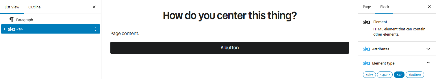
When you insert a button on a page, you may notice that it takes up the full width of the page. This is because ska-theme’s layout is grid-based – when you enter an element at the top level, then it is essentially a grid column that spans the full available content area. When you add the WordPress’ .alignwide class it spans even more “columns”, giving it a “breakout” effect, and .alignfull makes it span the whole viewport. In case of a button though, you probably just want it to flow normally or have it aligned to the center.
Aligning or centering
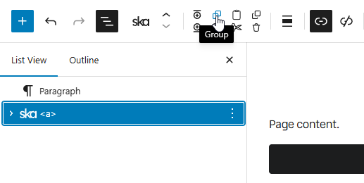
This is where being able to add Tailwind classes to everything comes in handy once again – add the place-self-start class to the button, and it does what it says on the tin – places itself to the start:

Change it to place-self-center and it goes to the center – no wrappers needed:

This doesn’t just apply to buttons – any root level element can be aligned like that. Using place-self-* is a shorthand that works on both axes, meaning it’s the same as using justify-self-* and align-self-* together – you could also only use the justify-self-* class – in this case they have the same result.
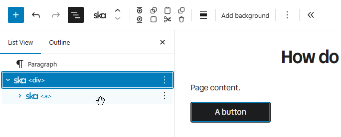
Alternatively, you can wrap button in another element:
…producing a <div> -> <a>, where <div> is now the element that spans full width, and the button flows naturally inside of it:
Now you could add text-center to the <div> to center the button, or give the <div> a different layout such as flex, block or grid using Tailwind classes and align based on how these display methods function.
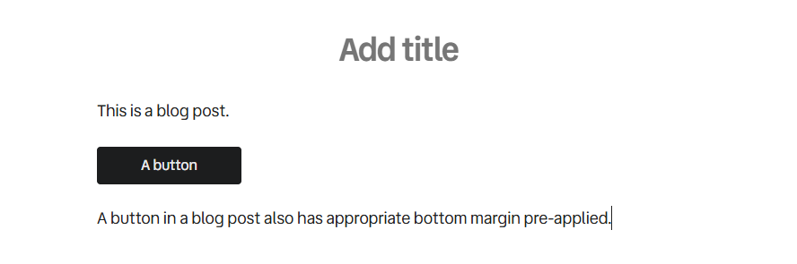
Buttons in blog posts
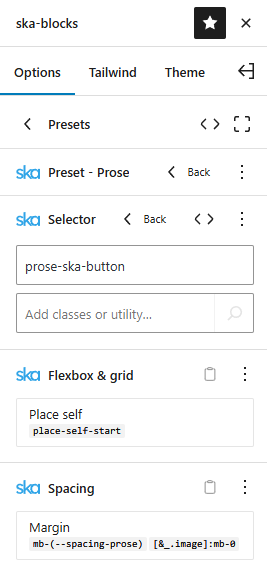
While powerful, this place-self-* mumbo-jumbo is probably too advanced for the average user who’s not familiar with Tailwind nor responsible for designing the site but is just writing a blog post. This is why the Prose preset (that is applied to all blog posts automatically) comes with place-self-start already applied to buttons, specifically using the prose-ska-button variant, which targets .ska-preset--ska-theme--button class name in prose context (but excluding .not-prose descendants), which is applied whenever you use the Button preset.
You can still apply place-self-center to the button (may need the ! important modifier for specificity) or use any other method of alignment.
The button also has bottom margin (mb-(--spacing-prose)) to keep the spacing consistent for any content that may come after it. If you don’t want bottom margin you can either use the mb-0! class which overrides the margin or the not-prose class (on the button itself or on one of the parent elements) which prevents the prose-specific styles from being applied in the first place.
As is typical with ska-theme, it is not hard-coded and set in stone – you can tailor all that functionality to your specific needs by editing the prose-ska-button selector in the Prose preset. The theme provides you with reasonable defaults, but you can change everything to make it your own. Once you edit the Prose preset it will no longer be altered by theme updates, but you will be able to view a diff to see if any useful new classes were added and merge them manually.
Being able to change the functionality rather than override it with additional custom CSS ensures that your site doesn’t become bloated with unused CSS over time – you can even remove things that are not necessary for your use case.