The Image block can be used to display different types of media. This documentation gives an overview of the modes that the Image block can operate in and provides copy-pastable examples of images styled in different ways.
Modes
The image block comes with multiple different modes of operation:

Mode – File
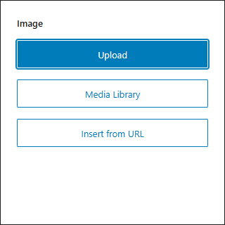
Choose an image file from WordPress Media Library, custom URL, upload it or use the Featured image (also works inside the core Query block).
Mode – SVG
Render any SVG image by insert raw SVG content.
Add Tailwind classes to the SVG by using normal block controls, Tailwind classes that are included in raw SVG content do not get detected.
By default the Sanitize option is enabled, which does some basic sanitization so you don’t accidentally XSS yourself when pasting a large unchecked SVG, but it may cause issues with some SVGs so turn it off when you have checked that the contents are not malicious.
Uncheck the Wrap option when you don’t want the <svg> element to be wrapped in an additional element. The Tailwind classes (and other block classes and attributes) you have configured will then be injected directly into the SVG markup that is provided.
Mode – Icon
By switching the Image block to “Icon” mode you can select a SVG icon from available icon packs.
Once you have selected an icon you can also switch back to SVG mode to edit your chosen icon. By default the width and height attributes are removed from bundled SVG icons to make them fluid, how ever if that’s not desirable the values can be recovered in the SVG mode from the data-svg-width and data-svg-height attributes. There are instances where you need the dimensions, and instances where you don’t, depends on the use case and SVG itself. The Icon mode also always wraps the <svg> element, if that is not desirable you can switch back to SVG mode as well, which has an option to toggle that functionality.
ska-icons plugin
By default ska-blocks doesn’t include any icons to keep the plugin size leaner. Download the ska-icons plugin to add Heroicons icons, Feather icons and Font Awesome icons.
ska-icons.zipExample icon
Icon from: https://heroicons.com
<!-- wp:ska/image {"mode":"icon","role":"presentation","svg":"\u003csvg viewBox=\u00220 0 24 24\u0022 fill=\u0022none\u0022 xmlns=\u0022http://www.w3.org/2000/svg\u0022\u003e\n\t\u003cpath d=\u0022M9 12.75L11.25 15L15 9.75M21 12C21 13.2683 20.3704 14.3895 19.4067 15.0682C19.6081 16.2294 19.2604 17.4672 18.3637 18.3639C17.467 19.2606 16.2292 19.6083 15.068 19.4069C14.3893 20.3705 13.2682 21 12 21C10.7319 21 9.61072 20.3705 8.93204 19.407C7.77066 19.6086 6.53256 19.261 5.6357 18.3641C4.73886 17.4673 4.39125 16.2292 4.59286 15.0678C3.62941 14.3891 3 13.2681 3 12C3 10.7319 3.62946 9.61077 4.59298 8.93208C4.39147 7.77079 4.7391 6.53284 5.63587 5.63607C6.53265 4.73929 7.77063 4.39166 8.93194 4.59319C9.61061 3.62955 10.7318 3 12 3C13.2682 3 14.3893 3.6295 15.068 4.59307C16.2294 4.39145 17.4674 4.73906 18.3643 5.6359C19.2611 6.53274 19.6087 7.77081 19.4071 8.93218C20.3706 9.61087 21 10.7319 21 12Z\u0022 stroke=\u0022currentColor\u0022 stroke-width=\u00221.5\u0022 stroke-linecap=\u0022round\u0022 stroke-linejoin=\u0022round\u0022 /\u003e\n\u003c/svg\u003e","collection":"heroicons","icon":"24/outline/check-badge","skaBlocks":{"cx":"size-24 text-primary","css":".size-24{width:var(--spacing-24);height:var(--spacing-24)}.text-primary{color:var(--color-primary)}","t":1758876679},"skaBlocksSize":{"v":{"$":{"@":"24"}}},"skaBlocksTextColor":{"v":{"$":{"@":"primary"}}}} -->
<div aria-hidden="true" class="size-24 text-primary wp-block-ska-image">
<svg viewBox="0 0 24 24" fill="none" xmlns="http://www.w3.org/2000/svg">
	<path d="M9 12.75L11.25 15L15 9.75M21 12C21 13.2683 20.3704 14.3895 19.4067 15.0682C19.6081 16.2294 19.2604 17.4672 18.3637 18.3639C17.467 19.2606 16.2292 19.6083 15.068 19.4069C14.3893 20.3705 13.2682 21 12 21C10.7319 21 9.61072 20.3705 8.93204 19.407C7.77066 19.6086 6.53256 19.261 5.6357 18.3641C4.73886 17.4673 4.39125 16.2292 4.59286 15.0678C3.62941 14.3891 3 13.2681 3 12C3 10.7319 3.62946 9.61077 4.59298 8.93208C4.39147 7.77079 4.7391 6.53284 5.63587 5.63607C6.53265 4.73929 7.77063 4.39166 8.93194 4.59319C9.61061 3.62955 10.7318 3 12 3C13.2682 3 14.3893 3.6295 15.068 4.59307C16.2294 4.39145 17.4674 4.73906 18.3643 5.6359C19.2611 6.53274 19.6087 7.77081 19.4071 8.93218C20.3706 9.61087 21 10.7319 21 12Z" stroke="currentColor" stroke-width="1.5" stroke-linecap="round" stroke-linejoin="round"></path>
</svg>
</div>
<!-- /wp:ska/image -->
Custom icons
For a few custom icons it’s easiest to just use the Image block in SVG mode and simply paste the icon file contents.
How ever, to add custom icon sets, they should be placed in your child theme directory in the icons folder.
For example: wp-content/themes/ska-theme-child/icons/my-custom-icons/*.svg.
Alternatively you can specify additional icon sources using a filter:
add_filter('ska_blocks_icon_sources', function($sources) {
	return array_merge([trailingslashit(dirname(__FILE__))], $sources);
});Mode – Lottie
Allows to render lightweight and scalable animations in the form of a Lottie .json file. Comes with some additional controls to configure how to render the Lottie.
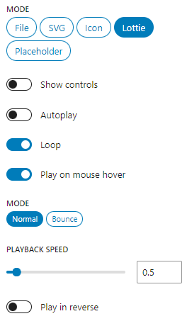
In order to upload .json files to WordPress Media Library you’ll need to enable the ska-blocks -> Options -> Permissions -> JSON uploads option. Alternatively upload the files to your child theme folder and use them with a direct link.
Example Lottie
Lottie from: https://animatedicons.co/icons
<!-- wp:ska/image {"mode":"lottie","role":"presentation","id":724,"lottieSpeed":0.5,"skaBlocks":{"cx":"size-32","css":".size-32{width:var(--spacing-32);height:var(--spacing-32)}","t":1758876679},"skaBlocksSize":{"v":{"$":{"@":"32"}}}} -->
<div aria-hidden="true" class="size-32 wp-block-ska-image"><lottie-player autoplay loop speed="0.5" direction="1" mode="normal" src="https://ska-blocks.com/docs/wp-content/uploads/sites/3/2024/03/Review.json"></lottie-player></div>
<!-- /wp:ska/image -->
Mode – Placeholder
Allows to render a placeholder image to hold a spot for a real image.
<!-- wp:ska/image {"role":"presentation","cover":true,"skaBlocks":{"cx":"aspect-square max-w-80","css":".aspect-square{aspect-ratio:1}.max-w-80{max-width:var(--spacing-80)}","t":1758876679},"skaBlocksAspectRatio":{"v":{"$":{"@":"square"}}},"skaBlocksMaxWidth":{"v":{"$":{"@":"80"}}}} -->
<div aria-hidden="true" class="aspect-square max-w-80 wp-block-ska-image">
<svg class="ska-placeholder w-full h-full object-cover rounded-[inherit] aspect-[inherit]" xmlns="http://www.w3.org/2000/svg" width="100%" height="100%">
<rect width="100%" height="100%" fill="#ddd"/>
<svg xmlns="http://www.w3.org/2000/svg" version="1.1" viewBox="0 0 512 512">
<path style="opacity:0.1" d="m203.77 188c-13.255 0-24 10.745-24 24s10.745 24 24 24 24-10.745 24-24-10.75-24-24-24zm147.55-44h-192c-17.225 0-31.555 14.325-31.555 32v160c0 17.675 14.325 32 31.55 32h192c17.675 0 32-14.325 32-32v-160c5e-3 -17.675-13.895-32-31.995-32zm8 188.65-68.4-92.95c-1.25-2.3-4.1-3.7-7.15-3.7-3.0565 0-5.91 1.384-7.605 3.6895l-53.3 72.05-18.545-23.05c-1.7205-2.1395-4.467-3.4045-7.385-3.4045-2.921 0-5.665 1.2645-7.39 3.4045l-37.76 46.905v0l-0.02-159.59c0-4.411 3.589-8 8-8h192c4.411 0 8 3.589 8 8v156.65z" stroke-width=".5"/>
</svg>
</svg>
</div>
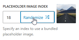
<!-- /wp:ska/image -->When the image block is in “Placeholder” mode, it will display the media picker when clicking on it, allowing to swap out the image with no technical knowledge required:
ska-theme comes with bundled placeholder images that you can choose from:

<!-- wp:ska/image {"role":"presentation","cover":true,"placeholderIndex":18,"skaBlocks":{"cx":"aspect-video","css":".aspect-video{aspect-ratio:var(--aspect-video)}","t":1758876679},"skaBlocksAspectRatio":{"v":{"$":{"@":"video"}}}} -->
<div aria-hidden="true" class="aspect-video wp-block-ska-image"><img src="%SKA_PLACEHOLDER_IMAGE%" class="w-full h-full object-cover rounded-[inherit] aspect-[inherit]"/></div>
<!-- /wp:ska/image -->
Features
Accessibility
Image block has a “Role” option which can be used to fine-tune its’ semantics:
- Image (or Link, when the image has a link)
Appliesrole="figure"to wrapper element, image should have an alt text provided. - Presentation
Hides the image from assistive technologies, no alt text is needed – use for decorative images. - None
Doesn’t apply any semantics.
When the image has a link you should provide an aria-label or title attribute, unless the image also has a suitable alt-text. When the image is using the “Lightbox” feature then it is also a link, but a “View image in full screen” aria-label is provided automatically.
Wrap & Cover
When the “Wrap” option is enabled then the image is rendered with a wrapper element (e.g. <div> -> <img>). All the Tailwind classes will be applied to the root element, so to target the image you would need to use * or [&>img] variants.
When the image has a link or lightbox then the wrapper element becomes an <a>.
When the image has a wrapper, the “Cover” option can be used to apply object-fit: cover CSS to the image, meaning it will always fill it’s container without any letterboxing. With “Cover” enabled, the image element automatically receives the Tailwind classes: w-full h-full object-cover rounded-[inherit] aspect-[inherit]. Should you need a different mode of object-fit, it can be overridden by adding a Tailwind class such as *:object-contain!.
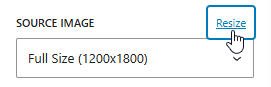
Resize images on the fly
When using an image from the WP Media Library you can insert custom dimensions and hit Resize to create an image with that size.
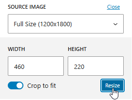
Specifying a “Custom” size when displaying a Featured image with the Image block will create a suitable size when first visiting the page where the featured image is requested:

Featured
When enabling the “Featured” option (available in “File” mode) the image block will display the current posts Featured image, instead of an image you chose yourself.
Meta key
In “Featured” mode, under block’s Advanced settings a “Meta key” option becomes available – this allows to override the image source from a featured image to a numeric image ID from any post meta key. For example, if you create an Advanced Custom Fields Image field with the “Return format” set to “Image ID” then this field’s value can be connected to the Image block.
Exclusive
By default the single post template displays the featured image below the post title in a predefined size (e.g. 16/9). Sometimes your featured image can be unsuitable to be displayed there or maybe you don’t want to display the featured image at all in a particular post – while still having a featured image attached to the post. For this reason there is an advanced option “Exclusive featured image“, which is enabled by default for ska-theme’s featured images – when enabled, the featured image will not render when the post content also contains an Image block with the Featured option enabled. This allows you to place the featured image anywhere in the blog post content, customize it’s appearance (or hide it – with sr-only class) and not have a duplicate image in your post.
Lightbox
The lightbox feature allows to enable showing the image in full screen using Photoswipe. To make the image “zoomable” enable the “Lightbox” option on the Image block.
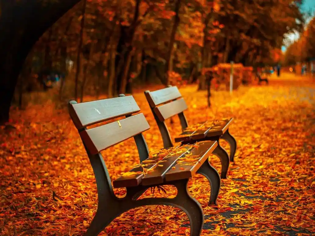
Image with a lightbox
Image from: https://picsum.photos

<!-- wp:ska/image {"mode":"file","width":1280,"height":768,"id":257,"lightbox":true} -->
<a class="wp-block-ska-image"><img src="https://ska-blocks.com/docs/wp-content/uploads/sites/3/2025/09/image-3.png" alt="Placeholder image" width="1280" height="768" loading="lazy"/></a>
<!-- /wp:ska/image -->
The same option is also available on the Gallery block, but you may choose to not enable the option and instead use the Lightbox block to combine multiple images and galleries into a single Lightbox instance.
Responsive
Enabling the “Responsive” option adds srcset and sizes attributes to the image using the WordPress core wp_image_add_srcset_and_sizes function allowing the browser to pick the best image size to load. In order to use this functionality the image needs to be added from the Media Library not from a direct link.
Loading
The image block comes with 4 loading modes:
- Lazy
Image will use the nativeloading="lazy"attribute. - Eager
Image will not use theloading="lazy"attribute, so it will be loaded normally. - LCP
Should be selected when the image is part of the Largest Contentful Paint: will usefetchpriority="high"anddecoding="syncattributes. - Preload
Can be selected for the highest possible loading priority. Image will be preloaded in the<head>and receivesdecoding="sync"attribute – use for critical above the fold images.
Low-res placeholder
For critical above the fold images the “Low-res placeholder” option can take a tiny version of the image and use it as a blurry/pixelated background image placeholder for the actual image.
While this method improves user experience by giving them something to look at much faster, it generally does not help with Lighthouse and its’ Largest Contentful Paint (LCP) metric.
The placeholder image can optionally be pre-loaded in the <head> for quick availability.
Transformation
WordPress core image block can be transformed into a ska/image block:
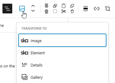
You can paste images from your clipboard directly into the block editor which will upload the image to your WP Media Library and create a core/image block, and then it can be transformed directly into a ska/image block. The transformation can also be done in reverse. For just basic images it’s fine to keep using the core image block, you can transform when advanced flexibility is needed, such as controlling the image loading, accessibility or adding custom HTML attributes.
Inline image
Under block’s Advanced settings, there is a button that can convert the current image into a base64-encoded string and use it as a data-URL. This saves an additional network request on the front end, but should only be used on very small images, as you will effectively be storing the image inside the post content as a string.

<!-- wp:ska/image {"mode":"file","wrap":false} -->
<img class="wp-block-ska-image" src="data:image/png;base64,iVBORw0KGgoAAAANSUhEUgAAAA4AAAAMCAYAAABSgIzaAAABBUlEQVR4AYyR6w1EUBCFT24bXm0IbRBtEMogtCG0IfSBOmy+SfxY2U1I5t47jzNzznD7vl9hGF5JkpjhXy8+VxSFxnE0y7JM+HrxueM4FMexfN9XVVXCf+KI9X0vrGkaYQ4QAZIEaIAPeNs2Y5CmqXhj0zRpXVe5russWNe1PM8zysMwiGJi0F+WhT7Gpm1b4Tsm3Bqhil+WpRUShwlNYAYgz3PLOTt/HDQAAD3ezxJbDtqiKDLRTIAqNwCoMhkgjW79Dh1ogwY3Sajio3+eZ1sQk2lCU2ps4q0N/mjBZwJvpmGAzvMUNTCx5dzjWXUQBGC+jEIAbBSjkf0O6DCem8QX6o/zAQAA//++wYw4AAAABklEQVQDACiWz6CwzkCUAAAAAElFTkSuQmCC" alt="Tiny inlined image example"/>
<!-- /wp:ska/image -->
Examples
Rounded image
<!-- wp:ska/image {"role":"presentation","cover":true,"placeholderIndex":14,"skaBlocks":{"cx":"aspect-video rounded-3xl","css":".aspect-video{aspect-ratio:var(--aspect-video)}.rounded-3xl{border-radius:var(--radius-3xl)}","t":1758876679},"skaBlocksAspectRatio":{"v":{"$":{"@":"video"}}},"skaBlocksBorderRadius":{"v":{"$":{"@":"3xl"}}}} -->
<div aria-hidden="true" class="aspect-video rounded-3xl wp-block-ska-image"><img src="%SKA_PLACEHOLDER_IMAGE%" class="w-full h-full object-cover rounded-[inherit] aspect-[inherit]"/></div>
<!-- /wp:ska/image -->
Circular image
<!-- wp:ska/image {"role":"presentation","cover":true,"placeholderIndex":13,"skaBlocks":{"cx":"aspect-square place-self-center w-full max-w-72 rounded-full","css":".aspect-square{aspect-ratio:1}.place-self-center{place-self:center}.w-full{width:100%}.max-w-72{max-width:var(--spacing-72)}.rounded-full{border-radius:3.40282e38px}","t":1758876679},"skaBlocksAspectRatio":{"v":{"$":{"@":"square"}}},"skaBlocksPlaceSelf":{"v":{"$":{"@":"center"}}},"skaBlocksWidth":{"v":{"$":{"@":"full"}}},"skaBlocksMaxWidth":{"v":{"$":{"@":"72"}}},"skaBlocksBorderRadius":{"v":{"$":{"@":"full"}}}} -->
<div aria-hidden="true" class="aspect-square place-self-center w-full max-w-72 rounded-full wp-block-ska-image"><img src="%SKA_PLACEHOLDER_IMAGE%" class="w-full h-full object-cover rounded-[inherit] aspect-[inherit]"/></div>
<!-- /wp:ska/image -->
Hover zoom image
<!-- wp:ska/image {"role":"presentation","cover":true,"placeholderIndex":23,"skaBlocks":{"cx":"aspect-video overflow-hidden rounded-xs *:transition-transform *:duration-500 *:hover:scale-110","css":".aspect-video{aspect-ratio:var(--aspect-video)}.overflow-hidden{overflow:hidden}.rounded-xs{border-radius:var(--radius-xs)}:is(.\u005c*\u005c:transition-transform\u003e*){transition-property:transform,translate,scale,rotate;transition-timing-function:var(--tw-ease,var(--default-transition-timing-function));transition-duration:var(--tw-duration,var(--default-transition-duration))}:is(.\u005c*\u005c:duration-500\u003e*){--tw-duration:.5s;transition-duration:.5s}@media (hover:hover){:is(.\u005c*\u005c:hover\u005c:scale-110\u003e*):hover{--tw-scale-x:110%;--tw-scale-y:110%;--tw-scale-z:110%;scale:var(--tw-scale-x)var(--tw-scale-y)}}","t":1758876679},"skaBlocksSelectors":{"*":{"skaBlocksScale":{"v":{"$":{"@":""},"hover":{"@":"110"}},"a":[]},"skaBlocksTransitionProperty":{"v":{"$":{"@":"transform"}}},"skaBlocksTransitionDuration":{"v":{"$":{"@":"500"}}}}},"skaBlocksAspectRatio":{"v":{"$":{"@":"video"}}},"skaBlocksOverflow":{"v":{"$":{"@":"hidden"}}},"skaBlocksBorderRadius":{"v":{"$":{"@":"xs"}}}} -->
<div aria-hidden="true" class="aspect-video overflow-hidden rounded-xs *:transition-transform *:duration-500 *:hover:scale-110 wp-block-ska-image"><img src="%SKA_PLACEHOLDER_IMAGE%" class="w-full h-full object-cover rounded-[inherit] aspect-[inherit]"/></div>
<!-- /wp:ska/image -->
Grayscale filter hover transition

<!-- wp:ska/image {"role":"presentation","cover":true,"placeholderIndex":33,"skaBlocks":{"cx":"aspect-video rounded-md not-hover:grayscale transition-[filter] duration-700","css":".aspect-video{aspect-ratio:var(--aspect-video)}.rounded-md{border-radius:var(--radius-md)}.not-hover\u005c:grayscale:not(:hover){--tw-grayscale:grayscale(100%);filter:var(--tw-blur,)var(--tw-brightness,)var(--tw-contrast,)var(--tw-grayscale,)var(--tw-hue-rotate,)var(--tw-invert,)var(--tw-saturate,)var(--tw-sepia,)var(--tw-drop-shadow,)}@media not all and (hover:hover){.not-hover\u005c:grayscale{--tw-grayscale:grayscale(100%);filter:var(--tw-blur,)var(--tw-brightness,)var(--tw-contrast,)var(--tw-grayscale,)var(--tw-hue-rotate,)var(--tw-invert,)var(--tw-saturate,)var(--tw-sepia,)var(--tw-drop-shadow,)}}.transition-\u005c[filter\u005c]{transition-property:filter;transition-timing-function:var(--tw-ease,var(--default-transition-timing-function));transition-duration:var(--tw-duration,var(--default-transition-duration))}.duration-700{--tw-duration:.7s;transition-duration:.7s}","t":1758876679},"skaBlocksAspectRatio":{"v":{"$":{"@":"video"}}},"skaBlocksBorderRadius":{"v":{"$":{"@":"md"}}},"skaBlocksGrayscale":{"v":{"$":{"@":""},"not-hover":{"@":"DEFAULT"}}},"skaBlocksTransitionProperty":{"v":{"$":{"@":"[filter]"}},"a":["[filter]"]},"skaBlocksTransitionDuration":{"v":{"$":{"@":"700"}}}} -->
<div aria-hidden="true" class="aspect-video rounded-md not-hover:grayscale transition-[filter] duration-700 wp-block-ska-image"><img src="%SKA_PLACEHOLDER_IMAGE%" class="w-full h-full object-cover rounded-[inherit] aspect-[inherit]"/></div>
<!-- /wp:ska/image -->
Saturated blurry image
<!-- wp:ska/image {"role":"presentation","cover":true,"placeholderIndex":19,"skaBlocks":{"cx":"aspect-video m-16 rounded-md not-hover:blur-md not-hover:brightness-125 not-hover:saturate-200 transition-[filter] duration-700","css":".aspect-video{aspect-ratio:var(--aspect-video)}.m-16{margin:var(--spacing-16)}.rounded-md{border-radius:var(--radius-md)}.not-hover\u005c:blur-md:not(:hover){--tw-blur:blur(var(--blur-md));filter:var(--tw-blur,)var(--tw-brightness,)var(--tw-contrast,)var(--tw-grayscale,)var(--tw-hue-rotate,)var(--tw-invert,)var(--tw-saturate,)var(--tw-sepia,)var(--tw-drop-shadow,)}@media not all and (hover:hover){.not-hover\u005c:blur-md{--tw-blur:blur(var(--blur-md));filter:var(--tw-blur,)var(--tw-brightness,)var(--tw-contrast,)var(--tw-grayscale,)var(--tw-hue-rotate,)var(--tw-invert,)var(--tw-saturate,)var(--tw-sepia,)var(--tw-drop-shadow,)}}.not-hover\u005c:brightness-125:not(:hover){--tw-brightness:brightness(125%);filter:var(--tw-blur,)var(--tw-brightness,)var(--tw-contrast,)var(--tw-grayscale,)var(--tw-hue-rotate,)var(--tw-invert,)var(--tw-saturate,)var(--tw-sepia,)var(--tw-drop-shadow,)}@media not all and (hover:hover){.not-hover\u005c:brightness-125{--tw-brightness:brightness(125%);filter:var(--tw-blur,)var(--tw-brightness,)var(--tw-contrast,)var(--tw-grayscale,)var(--tw-hue-rotate,)var(--tw-invert,)var(--tw-saturate,)var(--tw-sepia,)var(--tw-drop-shadow,)}}.not-hover\u005c:saturate-200:not(:hover){--tw-saturate:saturate(200%);filter:var(--tw-blur,)var(--tw-brightness,)var(--tw-contrast,)var(--tw-grayscale,)var(--tw-hue-rotate,)var(--tw-invert,)var(--tw-saturate,)var(--tw-sepia,)var(--tw-drop-shadow,)}@media not all and (hover:hover){.not-hover\u005c:saturate-200{--tw-saturate:saturate(200%);filter:var(--tw-blur,)var(--tw-brightness,)var(--tw-contrast,)var(--tw-grayscale,)var(--tw-hue-rotate,)var(--tw-invert,)var(--tw-saturate,)var(--tw-sepia,)var(--tw-drop-shadow,)}}.transition-\u005c[filter\u005c]{transition-property:filter;transition-timing-function:var(--tw-ease,var(--default-transition-timing-function));transition-duration:var(--tw-duration,var(--default-transition-duration))}.duration-700{--tw-duration:.7s;transition-duration:.7s}","t":1758876679},"skaBlocksAspectRatio":{"v":{"$":{"@":"video"}}},"skaBlocksMargin":{"v":{"$":{"@":"16"}}},"skaBlocksBorderRadius":{"v":{"$":{"@":"md"}}},"skaBlocksBlur":{"v":{"$":{"@":""},"not-hover":{"@":"md"}}},"skaBlocksBrightness":{"v":{"$":{"@":""},"not-hover":{"@":"125"}}},"skaBlocksSaturate":{"v":{"$":{"@":""},"not-hover":{"@":"200"}}},"skaBlocksTransitionProperty":{"v":{"$":{"@":"[filter]"}},"a":["[filter]"]},"skaBlocksTransitionDuration":{"v":{"$":{"@":"700"}}}} -->
<div aria-hidden="true" class="aspect-video m-16 rounded-md not-hover:blur-md not-hover:brightness-125 not-hover:saturate-200 transition-[filter] duration-700 wp-block-ska-image"><img src="%SKA_PLACEHOLDER_IMAGE%" class="w-full h-full object-cover rounded-[inherit] aspect-[inherit]"/></div>
<!-- /wp:ska/image -->
Corner cutting with clip-path


<!-- wp:ska/element {"skaBlocks":{"cx":"[--clip:var(--spacing-20)] *:aspect-square grid *:overflow-hidden grid-cols-2 gap-gutter m-gutter","css":".\u005c[--clip\u005c:var\u005c(--spacing-20\u005c)\u005c]{--clip:var(--spacing-20)}:is(.\u005c*\u005c:aspect-square\u003e*){aspect-ratio:1}.grid{display:grid}:is(.\u005c*\u005c:overflow-hidden\u003e*){overflow:hidden}.grid-cols-2{grid-template-columns:repeat(2,minmax(0,1fr))}.gap-gutter{gap:var(--gutter)}.m-gutter{margin:var(--gutter)}","t":1758876679},"skaBlocksAppender":{"type":"hidden"},"skaBlocksAs":{"element":"div"},"skaBlocksSelectors":{"*":{"skaBlocksSelectors":[],"skaBlocksAspectRatio":{"v":{"$":{"@":"square"}}},"skaBlocksOverflow":{"v":{"$":{"@":"hidden"}}}}},"skaBlocksVariables":{"record":{"--clip":{"value":"var(--spacing-20)","type":"spacing"}}},"skaBlocksDisplay":{"v":{"$":{"@":"grid"}}},"skaBlocksGridTemplateColumns":{"v":{"$":{"@":"2"},"sm":{"@":""},"lg":{"@":""}}},"skaBlocksGap":{"v":{"$":{"@":"gutter"}},"a":[]},"skaBlocksMargin":{"v":{"$":{"@":"gutter"}}}} -->
<div class="[--clip:var(--spacing-20)] *:aspect-square grid *:overflow-hidden grid-cols-2 gap-gutter m-gutter wp-block-ska-element">
<!-- wp:ska/image {"role":"presentation","loading":"eager","cover":true,"placeholderIndex":6,"skaBlocks":{"cx":"[clip-path:polygon(0_100%,0_var(--clip),var(--clip)_0,100%_0,100%_100%)]","css":".\u005c[clip-path\u005c:polygon\u005c(0_100\u005c%\u005c,0_var\u005c(--clip\u005c)\u005c,var\u005c(--clip\u005c)_0\u005c,100\u005c%_0\u005c,100\u005c%_100\u005c%\u005c)\u005c]{clip-path:polygon(0 100%,0 var(--clip),var(--clip)0,100% 0,100% 100%)}","t":1758876679},"skaBlocksVariables":{"record":{"clip-path":{"value":"polygon(0_100%,0_var(--clip),var(--clip)_0,100%_0,100%_100%)","type":""}}}} -->
<div aria-hidden="true" class="[clip-path:polygon(0_100%,0_var(--clip),var(--clip)_0,100%_0,100%_100%)] wp-block-ska-image"><img src="%SKA_PLACEHOLDER_IMAGE%" class="w-full h-full object-cover rounded-[inherit] aspect-[inherit]"/></div>
<!-- /wp:ska/image -->
<!-- wp:ska/image {"role":"presentation","loading":"eager","cover":true,"placeholderIndex":8,"skaBlocks":{"cx":"[clip-path:polygon(0_0,calc(100%-var(--clip))_0,100%_var(--clip),100%_100%,0_100%)]","css":".\u005c[clip-path\u005c:polygon\u005c(0_0\u005c,calc\u005c(100\u005c%-var\u005c(--clip\u005c)\u005c)_0\u005c,100\u005c%_var\u005c(--clip\u005c)\u005c,100\u005c%_100\u005c%\u005c,0_100\u005c%\u005c)\u005c]{clip-path:polygon(0 0,calc(100% - var(--clip))0,100% var(--clip),100% 100%,0 100%)}","t":1758876679},"skaBlocksVariables":{"record":{"clip-path":{"value":"polygon(0_0,calc(100%-var(--clip))_0,100%_var(--clip),100%_100%,0_100%)","type":""}}}} -->
<div aria-hidden="true" class="[clip-path:polygon(0_0,calc(100%-var(--clip))_0,100%_var(--clip),100%_100%,0_100%)] wp-block-ska-image"><img src="%SKA_PLACEHOLDER_IMAGE%" class="w-full h-full object-cover rounded-[inherit] aspect-[inherit]"/></div>
<!-- /wp:ska/image -->
<!-- wp:ska/image {"role":"presentation","loading":"eager","cover":true,"placeholderIndex":2,"skaBlocks":{"cx":"[clip-path:polygon(0_0,100%_0,100%_100%,var(--clip)_100%,0_calc(100%-var(--clip)))]","css":".\u005c[clip-path\u005c:polygon\u005c(0_0\u005c,100\u005c%_0\u005c,100\u005c%_100\u005c%\u005c,var\u005c(--clip\u005c)_100\u005c%\u005c,0_calc\u005c(100\u005c%-var\u005c(--clip\u005c)\u005c)\u005c)\u005c]{clip-path:polygon(0 0,100% 0,100% 100%,var(--clip)100%,0 calc(100% - var(--clip)))}","t":1758876679},"skaBlocksVariables":{"record":{"clip-path":{"value":"polygon(0_0,100%_0,100%_100%,var(--clip)_100%,0_calc(100%-var(--clip)))","type":""}}}} -->
<div aria-hidden="true" class="[clip-path:polygon(0_0,100%_0,100%_100%,var(--clip)_100%,0_calc(100%-var(--clip)))] wp-block-ska-image"><img src="%SKA_PLACEHOLDER_IMAGE%" class="w-full h-full object-cover rounded-[inherit] aspect-[inherit]"/></div>
<!-- /wp:ska/image -->
<!-- wp:ska/image {"role":"presentation","loading":"eager","cover":true,"placeholderIndex":26,"skaBlocks":{"cx":"[clip-path:polygon(0_0,100%_0,100%_calc(100%-var(--clip)),calc(100%-var(--clip))_100%,0_100%)]","css":".\u005c[clip-path\u005c:polygon\u005c(0_0\u005c,100\u005c%_0\u005c,100\u005c%_calc\u005c(100\u005c%-var\u005c(--clip\u005c)\u005c)\u005c,calc\u005c(100\u005c%-var\u005c(--clip\u005c)\u005c)_100\u005c%\u005c,0_100\u005c%\u005c)\u005c]{clip-path:polygon(0 0,100% 0,100% calc(100% - var(--clip)),calc(100% - var(--clip))100%,0 100%)}","t":1758876679},"skaBlocksVariables":{"record":{"clip-path":{"value":"polygon(0_0,100%_0,100%_calc(100%-var(--clip)),calc(100%-var(--clip))_100%,0_100%)","type":""}}}} -->
<div aria-hidden="true" class="[clip-path:polygon(0_0,100%_0,100%_calc(100%-var(--clip)),calc(100%-var(--clip))_100%,0_100%)] wp-block-ska-image"><img src="%SKA_PLACEHOLDER_IMAGE%" class="w-full h-full object-cover rounded-[inherit] aspect-[inherit]"/></div>
<!-- /wp:ska/image -->
</div>
<!-- /wp:ska/element -->
Image with a shadow

<!-- wp:ska/image {"role":"presentation","placeholderIndex":9,"skaBlocks":{"cx":"overflow-hidden place-self-center m-gutter w-full max-w-96 rounded-sm shadow-2xl hover:shadow-xl hover:shadow-orange-900/25 transition-shadow","css":".overflow-hidden{overflow:hidden}.place-self-center{place-self:center}.m-gutter{margin:var(--gutter)}.w-full{width:100%}.max-w-96{max-width:var(--spacing-96)}.rounded-sm{border-radius:var(--radius-sm)}.shadow-2xl{--tw-shadow:0 25px 50px -12px var(--tw-shadow-color,#00000040);box-shadow:var(--tw-inset-shadow),var(--tw-inset-ring-shadow),var(--tw-ring-offset-shadow),var(--tw-ring-shadow),var(--tw-shadow)}@media (hover:hover){.hover\u005c:shadow-xl:hover{--tw-shadow:0 20px 25px -5px var(--tw-shadow-color,#0000001a),0 8px 10px -6px var(--tw-shadow-color,#0000001a);box-shadow:var(--tw-inset-shadow),var(--tw-inset-ring-shadow),var(--tw-ring-offset-shadow),var(--tw-ring-shadow),var(--tw-shadow)}}@media (hover:hover){.hover\u005c:shadow-orange-900\u005c/25:hover{--tw-shadow-color:#7e2a0c40}@supports (color:color-mix(in lab, red, red)){.hover\u005c:shadow-orange-900\u005c/25:hover{--tw-shadow-color:color-mix(in oklab,color-mix(in oklab,var(--color-orange-900)25%,transparent)var(--tw-shadow-alpha),transparent)}}}.transition-shadow{transition-property:box-shadow;transition-timing-function:var(--tw-ease,var(--default-transition-timing-function));transition-duration:var(--tw-duration,var(--default-transition-duration))}","t":1758876679},"skaBlocksOverflow":{"v":{"$":{"@":"hidden"}}},"skaBlocksPlaceSelf":{"v":{"$":{"@":"center"}}},"skaBlocksMargin":{"v":{"$":{"@":"gutter"}}},"skaBlocksWidth":{"v":{"$":{"@":"full"}}},"skaBlocksMaxWidth":{"v":{"$":{"@":"96"}}},"skaBlocksBorderRadius":{"v":{"$":{"@":"sm"}}},"skaBlocksBoxShadow":{"v":{"$":{"@":"2xl"},"hover":{"@":"xl"}}},"skaBlocksBoxShadowColor":{"v":{"$":{"@":""},"hover":{"@":"orange-900/25"}}},"skaBlocksTransitionProperty":{"v":{"$":{"@":"shadow"}}}} -->
<div aria-hidden="true" class="overflow-hidden place-self-center m-gutter w-full max-w-96 rounded-sm shadow-2xl hover:shadow-xl hover:shadow-orange-900/25 transition-shadow wp-block-ska-image"><img src="%SKA_PLACEHOLDER_IMAGE%"/></div>
<!-- /wp:ska/image -->
Accented image

<!-- wp:ska/image {"role":"presentation","cover":true,"placeholderIndex":5,"skaBlocks":{"cx":"overflow-hidden place-self-center m-gutter w-full max-w-120 bg-primary-light rounded-3xl border border-primary shadow-lg shadow-primary/35","css":".overflow-hidden{overflow:hidden}.place-self-center{place-self:center}.m-gutter{margin:var(--gutter)}.w-full{width:100%}.max-w-120{max-width:calc(var(--spacing)*120)}.bg-primary-light{background-color:var(--color-primary-light)}.rounded-3xl{border-radius:var(--radius-3xl)}.border{border-style:var(--tw-border-style);border-width:1px}.border-primary{border-color:var(--color-primary)}.shadow-lg{--tw-shadow:0 10px 15px -3px var(--tw-shadow-color,#0000001a),0 4px 6px -4px var(--tw-shadow-color,#0000001a);box-shadow:var(--tw-inset-shadow),var(--tw-inset-ring-shadow),var(--tw-ring-offset-shadow),var(--tw-ring-shadow),var(--tw-shadow)}.shadow-primary\u005c/35{--tw-shadow-color:#2ba2e559}@supports (color:color-mix(in lab, red, red)){.shadow-primary\u005c/35{--tw-shadow-color:color-mix(in oklab,color-mix(in oklab,var(--color-primary)35%,transparent)var(--tw-shadow-alpha),transparent)}}","t":1758876679},"skaBlocksOverflow":{"v":{"$":{"@":"hidden"}}},"skaBlocksPlaceSelf":{"v":{"$":{"@":"center"}}},"skaBlocksMargin":{"v":{"$":{"@":"gutter"}}},"skaBlocksWidth":{"v":{"$":{"@":"full"}}},"skaBlocksMaxWidth":{"v":{"$":{"@":"120"}},"a":["120"]},"skaBlocksBackgroundColor":{"v":{"$":{"@":"primary-light"}}},"skaBlocksBorderRadius":{"v":{"$":{"@":"3xl"}}},"skaBlocksBorderWidth":{"v":{"$":{"@":"DEFAULT"}}},"skaBlocksBorderColor":{"v":{"$":{"@":"primary"}}},"skaBlocksBoxShadow":{"v":{"$":{"@":"lg"}}},"skaBlocksBoxShadowColor":{"v":{"$":{"@":"primary/35"}}}} -->
<div aria-hidden="true" class="overflow-hidden place-self-center m-gutter w-full max-w-120 bg-primary-light rounded-3xl border border-primary shadow-lg shadow-primary/35 wp-block-ska-image"><img src="%SKA_PLACEHOLDER_IMAGE%" class="w-full h-full object-cover rounded-[inherit] aspect-[inherit]"/></div>
<!-- /wp:ska/image -->
Different image on hover

<!-- wp:ska/element {"skaBlocks":{"cx":"aspect-[16/7] isolate relative *:absolute! *:inset-0 w-full *:size-full group","css":".aspect-\u005c[16\u005c/7\u005c]{aspect-ratio:16/7}.isolate{isolation:isolate}.relative{position:relative}:is(.\u005c*\u005c:absolute\u005c!\u003e*){position:absolute!important}:is(.\u005c*\u005c:inset-0\u003e*){inset:var(--spacing-0)}.w-full{width:100%}:is(.\u005c*\u005c:size-full\u003e*){width:100%;height:100%}","t":1758876679},"skaBlocksAppender":{"type":"hidden"},"skaBlocksSelectors":{"*":{"skaBlocksPosition":{"v":{"$":{"@":"absolute!"}}},"skaBlocksTopRightBottomLeft":{"v":{"$":{"@":"","i":"0"}},"t":"inset"},"skaBlocksSize":{"v":{"$":{"@":"full"}}}}},"skaBlocksAspectRatio":{"v":{"$":{"@":"[16/7]"}},"a":["[16/7]"]},"skaBlocksIsolation":{"v":{"$":{"@":"isolate"}}},"skaBlocksPosition":{"v":{"$":{"@":"relative"}}},"skaBlocksWidth":{"v":{"$":{"@":"full"}}},"skaBlocksGroup":{"v":{"$":{"@":"DEFAULT"}}}} -->
<div class="aspect-[16/7] isolate relative *:absolute! *:inset-0 w-full *:size-full group wp-block-ska-element">
<!-- wp:ska/image {"role":"presentation","cover":true,"placeholderIndex":26,"metadata":{"name":"Default image"}} -->
<div aria-hidden="true" class="wp-block-ska-image"><img src="%SKA_PLACEHOLDER_IMAGE%" class="w-full h-full object-cover rounded-[inherit] aspect-[inherit]"/></div>
<!-- /wp:ska/image -->
<!-- wp:ska/image {"role":"presentation","cover":true,"placeholderIndex":24,"metadata":{"name":"Hover image"},"skaBlocks":{"cx":"z-1 opacity-0 group-hover:opacity-100 transition-opacity duration-500","css":".z-1{z-index:1}.opacity-0{opacity:0}@media (hover:hover){.group-hover\u005c:opacity-100:is(:where(.group):hover *){opacity:1}}.transition-opacity{transition-property:opacity;transition-timing-function:var(--tw-ease,var(--default-transition-timing-function));transition-duration:var(--tw-duration,var(--default-transition-duration))}.duration-500{--tw-duration:.5s;transition-duration:.5s}","t":1758876679,"sb":false},"skaBlocksZIndex":{"v":{"$":{"@":"1"}}},"skaBlocksOpacity":{"v":{"$":{"@":"0"},"group-hover":{"@":"100"}}},"skaBlocksTransitionProperty":{"v":{"$":{"@":"opacity"}}},"skaBlocksTransitionDuration":{"v":{"$":{"@":"500"}}}} -->
<div aria-hidden="true" class="z-1 opacity-0 group-hover:opacity-100 transition-opacity duration-500 wp-block-ska-image"><img src="%SKA_PLACEHOLDER_IMAGE%" class="w-full h-full object-cover rounded-[inherit] aspect-[inherit]"/></div>
<!-- /wp:ska/image -->
</div>
<!-- /wp:ska/element -->
Skewed image
<!-- wp:ska/image {"role":"presentation","cover":true,"placeholderIndex":31,"skaBlocks":{"cx":"overflow-hidden place-self-center m-gutter w-full max-w-120 rounded-2xl shadow-md -skew-3","css":".overflow-hidden{overflow:hidden}.place-self-center{place-self:center}.m-gutter{margin:var(--gutter)}.w-full{width:100%}.max-w-120{max-width:calc(var(--spacing)*120)}.rounded-2xl{border-radius:var(--radius-2xl)}.shadow-md{--tw-shadow:0 4px 6px -1px var(--tw-shadow-color,#0000001a),0 2px 4px -2px var(--tw-shadow-color,#0000001a);box-shadow:var(--tw-inset-shadow),var(--tw-inset-ring-shadow),var(--tw-ring-offset-shadow),var(--tw-ring-shadow),var(--tw-shadow)}.-skew-3{--tw-skew-x:skewX(calc(3deg*-1));--tw-skew-y:skewY(calc(3deg*-1));transform:var(--tw-rotate-x,)var(--tw-rotate-y,)var(--tw-rotate-z,)var(--tw-skew-x,)var(--tw-skew-y,)}","t":1758876679},"skaBlocksOverflow":{"v":{"$":{"@":"hidden"}}},"skaBlocksPlaceSelf":{"v":{"$":{"@":"center"}}},"skaBlocksMargin":{"v":{"$":{"@":"gutter"}}},"skaBlocksWidth":{"v":{"$":{"@":"full"}}},"skaBlocksMaxWidth":{"v":{"$":{"@":"120"}},"a":["120"]},"skaBlocksBorderRadius":{"v":{"$":{"@":"2xl"}}},"skaBlocksBoxShadow":{"v":{"$":{"@":"md"}}},"skaBlocksSkew":{"v":{"$":{"@":"-3","x":"","y":""}}}} -->
<div aria-hidden="true" class="overflow-hidden place-self-center m-gutter w-full max-w-120 rounded-2xl shadow-md -skew-3 wp-block-ska-image"><img src="%SKA_PLACEHOLDER_IMAGE%" class="w-full h-full object-cover rounded-[inherit] aspect-[inherit]"/></div>
<!-- /wp:ska/image -->
Flat accent shadow
<!-- wp:ska/image {"role":"presentation","cover":true,"placeholderIndex":19,"skaBlocks":{"cx":"isolate relative after:absolute after:inset-0 after:-z-1 place-self-center m-gutter w-full max-w-96 after:bg-primary-light rounded-lg after:rounded-[inherit] after:translate-x-4 after:translate-y-4 after:translate-z-8","css":".isolate{isolation:isolate}.relative{position:relative}.after\u005c:absolute:after{content:var(--tw-content);position:absolute}.after\u005c:inset-0:after{content:var(--tw-content);inset:var(--spacing-0)}.after\u005c:-z-1:after{content:var(--tw-content);z-index:calc(1*-1)}.place-self-center{place-self:center}.m-gutter{margin:var(--gutter)}.w-full{width:100%}.max-w-96{max-width:var(--spacing-96)}.after\u005c:bg-primary-light:after{content:var(--tw-content);background-color:var(--color-primary-light)}.rounded-lg{border-radius:var(--radius-lg)}.after\u005c:rounded-\u005c[inherit\u005c]:after{content:var(--tw-content);border-radius:inherit}.after\u005c:translate-x-4:after{content:var(--tw-content);--tw-translate-x:var(--spacing-4);translate:var(--tw-translate-x)var(--tw-translate-y)}.after\u005c:translate-y-4:after{content:var(--tw-content);--tw-translate-y:var(--spacing-4);translate:var(--tw-translate-x)var(--tw-translate-y)}.after\u005c:translate-z-8:after{content:var(--tw-content);--tw-translate-z:var(--spacing-8);translate:var(--tw-translate-x)var(--tw-translate-y)var(--tw-translate-z)}","t":1758876679},"skaBlocksSelectors":{"after":{"skaBlocksPosition":{"v":{"$":{"@":"absolute"}}},"skaBlocksTopRightBottomLeft":{"v":{"$":{"@":"","i":"0"}},"t":"inset"},"skaBlocksTranslate":{"v":{"$":{"@":"","x":"4","z":"8","y":"4"}}},"skaBlocksBackgroundColor":{"v":{"$":{"@":"primary-light"}}},"skaBlocksBorderRadius":{"v":{"$":{"@":"[inherit]"}},"a":["[inherit]"]},"skaBlocksZIndex":{"v":{"$":{"@":"-1"}}}}},"skaBlocksIsolation":{"v":{"$":{"@":"isolate"}}},"skaBlocksPosition":{"v":{"$":{"@":"relative"}}},"skaBlocksPlaceSelf":{"v":{"$":{"@":"center"}}},"skaBlocksMargin":{"v":{"$":{"@":"gutter"}}},"skaBlocksWidth":{"v":{"$":{"@":"full"}}},"skaBlocksMaxWidth":{"v":{"$":{"@":"96"}}},"skaBlocksBorderRadius":{"v":{"$":{"@":"lg"}}}} -->
<div aria-hidden="true" class="isolate relative after:absolute after:inset-0 after:-z-1 place-self-center m-gutter w-full max-w-96 after:bg-primary-light rounded-lg after:rounded-[inherit] after:translate-x-4 after:translate-y-4 after:translate-z-8 wp-block-ska-image"><img src="%SKA_PLACEHOLDER_IMAGE%" class="w-full h-full object-cover rounded-[inherit] aspect-[inherit]"/></div>
<!-- /wp:ska/image -->
Stacked accent
<!-- wp:ska/image {"role":"presentation","cover":true,"placeholderIndex":2,"skaBlocks":{"cx":"aspect-square isolate relative before:absolute after:absolute before:inset-0 after:inset-0 before:-z-1 after:-z-2 place-self-center mx-8 my-16 w-full max-w-96 before:bg-primary-light/75 after:bg-primary-light/50 rounded-none before:rounded-[inherit] after:rounded-[inherit] before:transition-transform after:transition-transform before:duration-500 after:duration-700 before:ease-in-out after:ease-in-out before:scale-110 hover:before:scale-105 after:scale-120 hover:after:scale-110 hover:before:rotate-1 hover:after:-rotate-1 before:skew-2 hover:before:-skew-2 after:-skew-2 hover:after:skew-2","css":".aspect-square{aspect-ratio:1}.isolate{isolation:isolate}.relative{position:relative}.before\u005c:absolute:before{content:var(--tw-content);position:absolute}.after\u005c:absolute:after{content:var(--tw-content);position:absolute}.before\u005c:inset-0:before{content:var(--tw-content);inset:var(--spacing-0)}.after\u005c:inset-0:after{content:var(--tw-content);inset:var(--spacing-0)}.before\u005c:-z-1:before{content:var(--tw-content);z-index:calc(1*-1)}.after\u005c:-z-2:after{content:var(--tw-content);z-index:calc(2*-1)}.place-self-center{place-self:center}.mx-8{margin-inline:var(--spacing-8)}.my-16{margin-block:var(--spacing-16)}.w-full{width:100%}.max-w-96{max-width:var(--spacing-96)}.before\u005c:bg-primary-light\u005c/75:before{content:var(--tw-content);background-color:color-mix(in srgb,color-mix(in oklab,var(--color-primary),white 10%)75%,transparent)}@supports (color:color-mix(in lab, red, red)){.before\u005c:bg-primary-light\u005c/75:before{background-color:color-mix(in oklab,var(--color-primary-light)75%,transparent)}}.after\u005c:bg-primary-light\u005c/50:after{content:var(--tw-content);background-color:color-mix(in srgb,color-mix(in oklab,var(--color-primary),white 10%)50%,transparent)}@supports (color:color-mix(in lab, red, red)){.after\u005c:bg-primary-light\u005c/50:after{background-color:color-mix(in oklab,var(--color-primary-light)50%,transparent)}}.rounded-none{border-radius:0}.before\u005c:rounded-\u005c[inherit\u005c]:before{content:var(--tw-content);border-radius:inherit}.after\u005c:rounded-\u005c[inherit\u005c]:after{content:var(--tw-content);border-radius:inherit}.before\u005c:transition-transform:before{content:var(--tw-content);transition-property:transform,translate,scale,rotate;transition-timing-function:var(--tw-ease,var(--default-transition-timing-function));transition-duration:var(--tw-duration,var(--default-transition-duration))}.after\u005c:transition-transform:after{content:var(--tw-content);transition-property:transform,translate,scale,rotate;transition-timing-function:var(--tw-ease,var(--default-transition-timing-function));transition-duration:var(--tw-duration,var(--default-transition-duration))}.before\u005c:duration-500:before{content:var(--tw-content);--tw-duration:.5s;transition-duration:.5s}.after\u005c:duration-700:after{content:var(--tw-content);--tw-duration:.7s;transition-duration:.7s}.before\u005c:ease-in-out:before{content:var(--tw-content);--tw-ease:var(--ease-in-out);transition-timing-function:var(--ease-in-out)}.after\u005c:ease-in-out:after{content:var(--tw-content);--tw-ease:var(--ease-in-out);transition-timing-function:var(--ease-in-out)}.before\u005c:scale-110:before{content:var(--tw-content);--tw-scale-x:110%;--tw-scale-y:110%;--tw-scale-z:110%;scale:var(--tw-scale-x)var(--tw-scale-y)}@media (hover:hover){.hover\u005c:before\u005c:scale-105:hover:before{content:var(--tw-content);--tw-scale-x:105%;--tw-scale-y:105%;--tw-scale-z:105%;scale:var(--tw-scale-x)var(--tw-scale-y)}}.after\u005c:scale-120:after{content:var(--tw-content);--tw-scale-x:120%;--tw-scale-y:120%;--tw-scale-z:120%;scale:var(--tw-scale-x)var(--tw-scale-y)}@media (hover:hover){.hover\u005c:after\u005c:scale-110:hover:after{content:var(--tw-content);--tw-scale-x:110%;--tw-scale-y:110%;--tw-scale-z:110%;scale:var(--tw-scale-x)var(--tw-scale-y)}}@media (hover:hover){.hover\u005c:before\u005c:rotate-1:hover:before{content:var(--tw-content);rotate:1deg}}@media (hover:hover){.hover\u005c:after\u005c:-rotate-1:hover:after{content:var(--tw-content);rotate:-1deg}}.before\u005c:skew-2:before{content:var(--tw-content);--tw-skew-x:skewX(2deg);--tw-skew-y:skewY(2deg);transform:var(--tw-rotate-x,)var(--tw-rotate-y,)var(--tw-rotate-z,)var(--tw-skew-x,)var(--tw-skew-y,)}@media (hover:hover){.hover\u005c:before\u005c:-skew-2:hover:before{content:var(--tw-content);--tw-skew-x:skewX(calc(2deg*-1));--tw-skew-y:skewY(calc(2deg*-1));transform:var(--tw-rotate-x,)var(--tw-rotate-y,)var(--tw-rotate-z,)var(--tw-skew-x,)var(--tw-skew-y,)}}.after\u005c:-skew-2:after{content:var(--tw-content);--tw-skew-x:skewX(calc(2deg*-1));--tw-skew-y:skewY(calc(2deg*-1));transform:var(--tw-rotate-x,)var(--tw-rotate-y,)var(--tw-rotate-z,)var(--tw-skew-x,)var(--tw-skew-y,)}@media (hover:hover){.hover\u005c:after\u005c:skew-2:hover:after{content:var(--tw-content);--tw-skew-x:skewX(2deg);--tw-skew-y:skewY(2deg);transform:var(--tw-rotate-x,)var(--tw-rotate-y,)var(--tw-rotate-z,)var(--tw-skew-x,)var(--tw-skew-y,)}}","t":1758876679,"sb":false},"skaBlocksSelectors":{"before":{"skaBlocksPosition":{"v":{"$":{"@":"absolute"}}},"skaBlocksTopRightBottomLeft":{"v":{"$":{"@":"","i":"0"}},"t":"inset"},"skaBlocksBackgroundColor":{"v":{"$":{"@":"primary-light/75"}}},"skaBlocksBorderRadius":{"v":{"$":{"@":"[inherit]"}},"a":["[inherit]"]},"skaBlocksZIndex":{"v":{"$":{"@":"-1"}}},"skaBlocksScale":{"v":{"$":{"@":"110"},"\u003chover":{"@":"105"}}},"skaBlocksTransitionProperty":{"v":{"$":{"@":"transform"}}},"skaBlocksTransitionDuration":{"v":{"$":{"@":"500"}}},"skaBlocksTransitionTimingFunction":{"v":{"$":{"@":"in-out"}}},"skaBlocksRotate":{"v":{"$":{"@":""},"\u003chover":{"@":"1"}}},"skaBlocksSkew":{"v":{"$":{"@":"2","x":""},"\u003chover":{"@":"-2"}}}},"after":{"skaBlocksPosition":{"v":{"$":{"@":"absolute"}}},"skaBlocksTopRightBottomLeft":{"v":{"$":{"@":"","i":"0"}},"t":"inset"},"skaBlocksBackgroundColor":{"v":{"$":{"@":"primary-light/50"}}},"skaBlocksBorderRadius":{"v":{"$":{"@":"[inherit]"}},"a":["[inherit]"]},"skaBlocksZIndex":{"v":{"$":{"@":"-2"}}},"skaBlocksScale":{"v":{"$":{"@":"120"},"\u003chover":{"@":"110"}},"a":["120"]},"skaBlocksTransitionProperty":{"v":{"$":{"@":"transform"}}},"skaBlocksTransitionDuration":{"v":{"$":{"@":"700"}}},"skaBlocksTransitionTimingFunction":{"v":{"$":{"@":"in-out"}}},"skaBlocksRotate":{"v":{"$":{"@":""},"\u003chover":{"@":"-1"}}},"skaBlocksSkew":{"v":{"$":{"@":"-2"},"\u003chover":{"@":"2"}}}}},"skaBlocksAspectRatio":{"v":{"$":{"@":"square"}}},"skaBlocksIsolation":{"v":{"$":{"@":"isolate"}}},"skaBlocksPosition":{"v":{"$":{"@":"relative"}}},"skaBlocksPlaceSelf":{"v":{"$":{"@":"center"}}},"skaBlocksMargin":{"v":{"$":{"@":"","x":"8","y":"16"}},"t":"axis"},"skaBlocksWidth":{"v":{"$":{"@":"full"}}},"skaBlocksMaxWidth":{"v":{"$":{"@":"96"}}},"skaBlocksBorderRadius":{"v":{"$":{"@":"none"}}}} -->
<div aria-hidden="true" class="aspect-square isolate relative before:absolute after:absolute before:inset-0 after:inset-0 before:-z-1 after:-z-2 place-self-center mx-8 my-16 w-full max-w-96 before:bg-primary-light/75 after:bg-primary-light/50 rounded-none before:rounded-[inherit] after:rounded-[inherit] before:transition-transform after:transition-transform before:duration-500 after:duration-700 before:ease-in-out after:ease-in-out before:scale-110 hover:before:scale-105 after:scale-120 hover:after:scale-110 hover:before:rotate-1 hover:after:-rotate-1 before:skew-2 hover:before:-skew-2 after:-skew-2 hover:after:skew-2 wp-block-ska-image"><img src="%SKA_PLACEHOLDER_IMAGE%" class="w-full h-full object-cover rounded-[inherit] aspect-[inherit]"/></div>
<!-- /wp:ska/image -->
Next-gen examples
The new CSS corner-shape property allows for creating unique-looking images. For now there is only support for Chrome-based browsers and there is no Tailwind CSS utility for it so a fully arbitrary class needs to be used (which can be done using the “Variables” feature of ska-blocks).
Squircular image
[corner-shape:squircle] rounded-4xl
<!-- wp:ska/image {"role":"presentation","placeholderIndex":5,"skaBlocks":{"cx":"[corner-shape:squircle] aspect-video overflow-hidden rounded-4xl","css":".\u005c[corner-shape\u005c:squircle\u005c]{corner-shape:squircle}.aspect-video{aspect-ratio:var(--aspect-video)}.overflow-hidden{overflow:hidden}.rounded-4xl{border-radius:var(--radius-4xl)}","t":1758876679},"skaBlocksVariables":{"record":{"corner-shape":{"value":"squircle","type":""}}},"skaBlocksAspectRatio":{"v":{"$":{"@":"video"}}},"skaBlocksOverflow":{"v":{"$":{"@":"hidden"}}},"skaBlocksBorderRadius":{"v":{"$":{"@":"4xl"}}}} -->
<div aria-hidden="true" class="[corner-shape:squircle] aspect-video overflow-hidden rounded-4xl wp-block-ska-image"><img src="%SKA_PLACEHOLDER_IMAGE%"/></div>
<!-- /wp:ska/image -->
Note: when using a wrapper element, you may also need to add *:[corner-shape:inherit] class or apply the corner shape directly to the image element:
Notch
[corner-shape:notch] rounded-4xl

<!-- wp:ska/image {"role":"presentation","cover":true,"placeholderIndex":25,"skaBlocks":{"cx":"[corner-shape:notch] aspect-video overflow-hidden rounded-4xl","css":".\u005c[corner-shape\u005c:notch\u005c]{corner-shape:notch}.aspect-video{aspect-ratio:var(--aspect-video)}.overflow-hidden{overflow:hidden}.rounded-4xl{border-radius:var(--radius-4xl)}","t":1758876679},"skaBlocksVariables":{"record":{"corner-shape":{"value":"notch","type":""}}},"skaBlocksAspectRatio":{"v":{"$":{"@":"video"}}},"skaBlocksOverflow":{"v":{"$":{"@":"hidden"}}},"skaBlocksBorderRadius":{"v":{"$":{"@":"4xl"}}}} -->
<div aria-hidden="true" class="[corner-shape:notch] aspect-video overflow-hidden rounded-4xl wp-block-ska-image"><img src="%SKA_PLACEHOLDER_IMAGE%" class="w-full h-full object-cover rounded-[inherit] aspect-[inherit]"/></div>
<!-- /wp:ska/image -->
Scoop
[corner-shape:scoop] rounded-[3rem]
<!-- wp:ska/image {"role":"presentation","cover":true,"placeholderIndex":16,"skaBlocks":{"cx":"[corner-shape:scoop] aspect-video overflow-hidden rounded-[3rem]","css":".\u005c[corner-shape\u005c:scoop\u005c]{corner-shape:scoop}.aspect-video{aspect-ratio:var(--aspect-video)}.overflow-hidden{overflow:hidden}.rounded-\u005c[3rem\u005c]{border-radius:3rem}","t":1758876679},"skaBlocksVariables":{"record":{"corner-shape":{"value":"scoop","type":""}}},"skaBlocksAspectRatio":{"v":{"$":{"@":"video"}}},"skaBlocksOverflow":{"v":{"$":{"@":"hidden"}}},"skaBlocksBorderRadius":{"v":{"$":{"@":"[3rem]"}},"a":["[3rem]"]}} -->
<div aria-hidden="true" class="[corner-shape:scoop] aspect-video overflow-hidden rounded-[3rem] wp-block-ska-image"><img src="%SKA_PLACEHOLDER_IMAGE%" class="w-full h-full object-cover rounded-[inherit] aspect-[inherit]"/></div>
<!-- /wp:ska/image -->
Bevel
[corner-shape:bevel] rounded-4xl

<!-- wp:ska/image {"role":"presentation","cover":true,"placeholderIndex":3,"skaBlocks":{"cx":"[corner-shape:bevel] aspect-video overflow-hidden rounded-4xl","css":".\u005c[corner-shape\u005c:bevel\u005c]{corner-shape:bevel}.aspect-video{aspect-ratio:var(--aspect-video)}.overflow-hidden{overflow:hidden}.rounded-4xl{border-radius:var(--radius-4xl)}","t":1758876679},"skaBlocksVariables":{"record":{"corner-shape":{"value":"bevel","type":""}}},"skaBlocksAspectRatio":{"v":{"$":{"@":"video"}}},"skaBlocksOverflow":{"v":{"$":{"@":"hidden"}}},"skaBlocksBorderRadius":{"v":{"$":{"@":"4xl"}},"a":[]}} -->
<div aria-hidden="true" class="[corner-shape:bevel] aspect-video overflow-hidden rounded-4xl wp-block-ska-image"><img src="%SKA_PLACEHOLDER_IMAGE%" class="w-full h-full object-cover rounded-[inherit] aspect-[inherit]"/></div>
<!-- /wp:ska/image -->
[corner-shape:bevel] rounded-full
<!-- wp:ska/image {"role":"presentation","cover":true,"placeholderIndex":8,"skaBlocks":{"cx":"[corner-shape:bevel] aspect-video overflow-hidden rounded-full","css":".\u005c[corner-shape\u005c:bevel\u005c]{corner-shape:bevel}.aspect-video{aspect-ratio:var(--aspect-video)}.overflow-hidden{overflow:hidden}.rounded-full{border-radius:3.40282e38px}","t":1758876679},"skaBlocksVariables":{"record":{"corner-shape":{"value":"bevel","type":""}}},"skaBlocksAspectRatio":{"v":{"$":{"@":"video"}}},"skaBlocksOverflow":{"v":{"$":{"@":"hidden"}}},"skaBlocksBorderRadius":{"v":{"$":{"@":"full"}},"a":[]}} -->
<div aria-hidden="true" class="[corner-shape:bevel] aspect-video overflow-hidden rounded-full wp-block-ska-image"><img src="%SKA_PLACEHOLDER_IMAGE%" class="w-full h-full object-cover rounded-[inherit] aspect-[inherit]"/></div>
<!-- /wp:ska/image -->
[corner-shape:bevel] rounded-full aspect-square

<!-- wp:ska/image {"role":"presentation","cover":true,"placeholderIndex":15,"skaBlocks":{"cx":"[corner-shape:bevel] aspect-square overflow-hidden rounded-full","css":".\u005c[corner-shape\u005c:bevel\u005c]{corner-shape:bevel}.aspect-square{aspect-ratio:1}.overflow-hidden{overflow:hidden}.rounded-full{border-radius:3.40282e38px}","t":1758876679},"skaBlocksVariables":{"record":{"corner-shape":{"value":"bevel","type":""}}},"skaBlocksAspectRatio":{"v":{"$":{"@":"square"}}},"skaBlocksOverflow":{"v":{"$":{"@":"hidden"}}},"skaBlocksBorderRadius":{"v":{"$":{"@":"full"}},"a":[]}} -->
<div aria-hidden="true" class="[corner-shape:bevel] aspect-square overflow-hidden rounded-full wp-block-ska-image"><img src="%SKA_PLACEHOLDER_IMAGE%" class="w-full h-full object-cover rounded-[inherit] aspect-[inherit]"/></div>
<!-- /wp:ska/image -->
Superellipse
[corner-shape:superellipse(-0.25)] rounded-full

<!-- wp:ska/image {"role":"presentation","cover":true,"placeholderIndex":32,"skaBlocks":{"cx":"[corner-shape:superellipse(-0.25)] aspect-video overflow-hidden rounded-full","css":".\u005c[corner-shape\u005c:superellipse\u005c(-0\u005c.25\u005c)\u005c]{corner-shape:superellipse(-.25)}.aspect-video{aspect-ratio:var(--aspect-video)}.overflow-hidden{overflow:hidden}.rounded-full{border-radius:3.40282e38px}","t":1758876679},"skaBlocksVariables":{"record":{"corner-shape":{"value":"superellipse(-0.25)","type":""}}},"skaBlocksAspectRatio":{"v":{"$":{"@":"video"}}},"skaBlocksOverflow":{"v":{"$":{"@":"hidden"}}},"skaBlocksBorderRadius":{"v":{"$":{"@":"full"}},"a":[]}} -->
<div aria-hidden="true" class="[corner-shape:superellipse(-0.25)] aspect-video overflow-hidden rounded-full wp-block-ska-image"><img src="%SKA_PLACEHOLDER_IMAGE%" class="w-full h-full object-cover rounded-[inherit] aspect-[inherit]"/></div>
<!-- /wp:ska/image -->