The Slider block allows creating sliders using the popular Swiper slider.
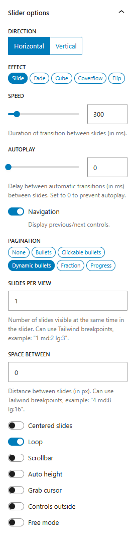
Various UI controls for configuring Swiper options are provided.
Slides per view and Space between options can use Tailwind-like breakpoint syntax, e.g. 8 sm:16 lg:32.
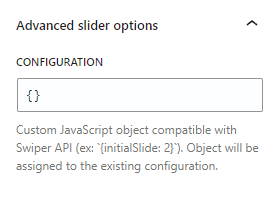
When the controls are not enough, you can provide a custom JavaScript object with additional Swiper configuration (e.g. {parallax: true}):
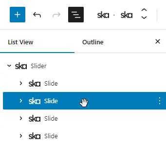
The slider itself does not function in the block editor, instead all the slides are rendered at once, which can get quite cluttered. The option to Hide other slides can help:
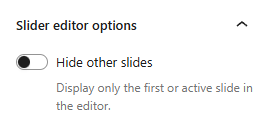
When enabled, you’ll only see the first slide of the slider, unless you use the List View to activate another slide:
Tailwind variants for Swiper slider
There are preconfigured custom Tailwind variants for targetting various Swiper slider UI parts. For example, instead of using an arbitrary variant [&_.swiper-wrapper]:border to add a border to the Swiper wrapper you can use swiper-wrapper:border.
| Custom variant | CSS selector |
|---|---|
swiper | :is(&.swiper, & .swiper) |
swiper-wrapper | & .swiper-wrapper |
swiper-slide | & .swiper-slide |
swiper-nav | &:not(.use-default-nav, :has(.use-default-nav)) :where(.swiper-button-next, .swiper-button-prev) |
swiper-nav-prev | &.swiper-button-prev |
swiper-nav-next | &.swiper-button-next |
swiper-nav-hover | &:not([aria-disabled=true]):hover |
swiper-nav-focus | &:not([aria-disabled=true]):focus |
swiper-nav-active | &:not([aria-disabled=true]):active |
swiper-scrollbar | & .swiper-scrollbar |
swiper-pagination | & .swiper-pagination |
swiper-bullets | & .swiper-pagination-bullets |
swiper-bullet | & .swiper-pagination-bullet |
swiper-bullet-active | & .swiper-pagination-bullet-active |
Swiper preset
With ska-theme the block also has the Swiper preset applied by default to provide shared styles for theme color, navigation controls appearance and more. The .use-default-nav class can be used to disable navigation controls appearance on a specific slider.
Variables can also be set on the Slider block itself to configure Swiper CSS variables using Tailwind values:
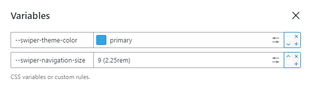
Simply enter --swiper-theme-color to the Add classes or utility... field to create a control for a Tailwind CSS variable.
Gallery
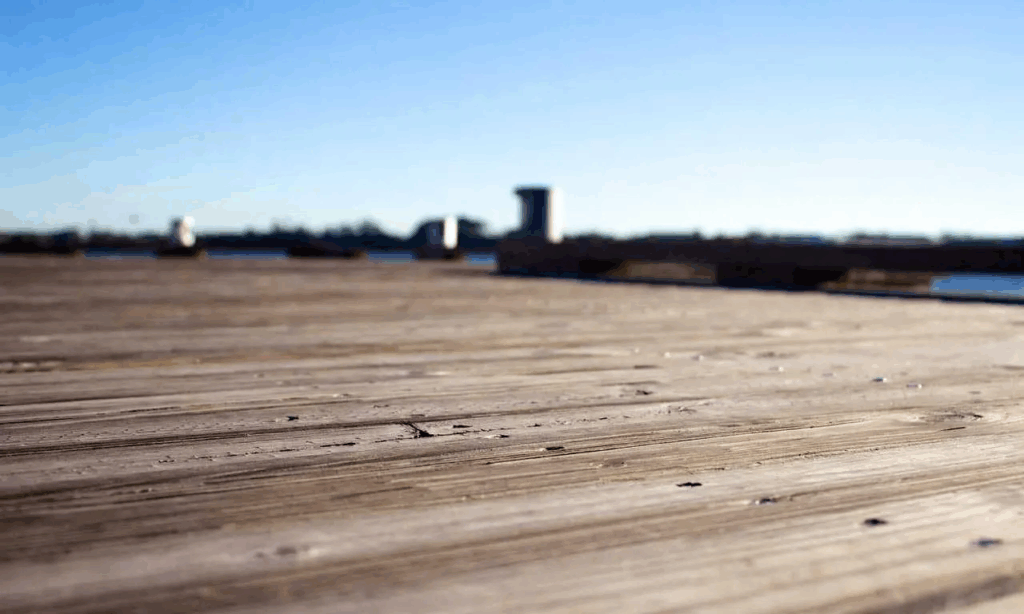
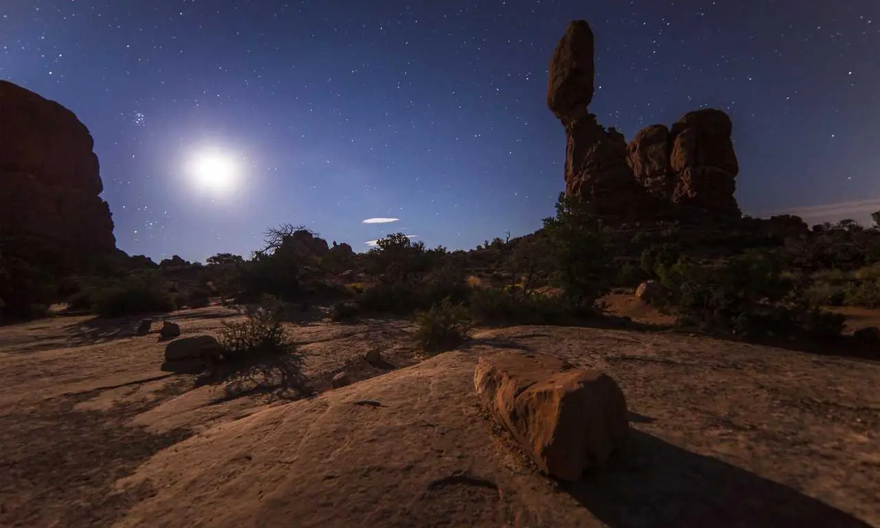
Images: https://picsum.photos
When inserting a Gallery block into a Slider block, disable the Wrap option on the Gallery block so that it doesn’t wrap gallery images in an element and allows the individual images to become slides themselves.


<!-- wp:ska/slider {"pagination":"dynamic-bullets","loop":true,"skaBlocksSelectors":{"[\u0026_.swiper-slide]":[]}} -->
<div class="swiper wp-block-ska-slider" data-ska-swiper="{{ska-slider-id}}"><div class="swiper-wrapper">
<!-- wp:ska/gallery {"ids":[264,265,257,263,261,262,260,267,266],"size":"large","wrap":false,"skaBlocks":{"cx":"grid grid-cols-auto-fit-xs gap-4","css":".grid{display:grid}.grid-cols-auto-fit-xs{grid-template-columns:repeat(auto-fit,minmax(min(var(--spacing-48),100%),1fr))}.gap-4{gap:var(--spacing-4)}","t":1758876679},"skaBlocksDisplay":{"v":{"$":{"@":"grid"}}},"skaBlocksGridTemplateColumns":{"v":{"$":{"@":"auto-fit-xs"}}},"skaBlocksGap":{"v":{"$":{"@":"4"}}}} -->
<div class="grid grid-cols-auto-fit-xs gap-4 wp-block-ska-gallery"><span class="ska-gallery-content-placeholder"></span></div>
<!-- /wp:ska/gallery -->
</div><div class="swiper-pagination"></div><div class="swiper-button-prev ska-swiper-nav__button"></div><div class="swiper-button-next ska-swiper-nav__button"></div></div>
<!-- /wp:ska/slider -->
Optionally, setting the gallery images to Link to -> Full size image and wrapping the slider with the Lightbox block allows the have a slider with a gallery that has a lightbox.


<!-- wp:ska/lightbox -->
<div class="wp-block-ska-lightbox">
<!-- wp:ska/slider {"effect":"cube","speed":600,"pagination":"dynamic-bullets","loop":true,"skaBlocksSelectors":{"[\u0026_.swiper-slide]":[]}} -->
<div class="swiper wp-block-ska-slider" data-ska-swiper="{{ska-slider-id}}"><div class="swiper-wrapper">
<!-- wp:ska/gallery {"ids":[261,264,266,265,260,257],"size":"large","linkTo":"full","wrap":false,"skaBlocks":{"cx":"grid grid-cols-auto-fit-xs gap-4","css":".grid{display:grid}.grid-cols-auto-fit-xs{grid-template-columns:repeat(auto-fit,minmax(min(var(--spacing-48),100%),1fr))}.gap-4{gap:var(--spacing-4)}","t":1758876679},"skaBlocksDisplay":{"v":{"$":{"@":"grid"}}},"skaBlocksGridTemplateColumns":{"v":{"$":{"@":"auto-fit-xs"}}},"skaBlocksGap":{"v":{"$":{"@":"4"}}}} -->
<div class="grid grid-cols-auto-fit-xs gap-4 wp-block-ska-gallery"><span class="ska-gallery-content-placeholder"></span></div>
<!-- /wp:ska/gallery -->
</div><div class="swiper-pagination"></div><div class="swiper-button-prev ska-swiper-nav__button"></div><div class="swiper-button-next ska-swiper-nav__button"></div></div>
<!-- /wp:ska/slider -->
</div>
<!-- /wp:ska/lightbox -->
Query
The core WordPress Query block can be inserted into the Slider block to create slides from the results of the query.
Example slider rendering posts with “Blocks” tag using the WordPress “Query” block inside the “Slider” block
<!-- wp:ska/slider {"effect":"coverflow","pagination":"fraction","autoHeight":true,"controlsOutside":true,"skaBlocks":{"cx":"[--swiper-pagination-fraction-color:var(--color-site-muted)] p-6 swiper-pagination:text-sm rounded border shadow","css":".\u005c[--swiper-pagination-fraction-color\u005c:var\u005c(--color-site-muted\u005c)\u005c]{--swiper-pagination-fraction-color:var(--color-site-muted)}.p-6{padding:var(--spacing-6)}.swiper-pagination\u005c:text-sm .swiper-pagination{font-size:var(--text-sm);line-height:var(--tw-leading,var(--text-sm--line-height))}.rounded{border-radius:var(--radius)}.border{border-style:var(--tw-border-style);border-width:1px}.shadow{--tw-shadow:var(--shadow-sm);box-shadow:var(--tw-inset-shadow),var(--tw-inset-ring-shadow),var(--tw-ring-offset-shadow),var(--tw-ring-shadow),var(--tw-shadow)}","t":1758876679},"skaBlocksSelectors":{"swiper-slide":[]},"skaBlocksVariables":{"record":{"--swiper-pagination-fraction-color":{"value":"var(--color-site-muted)","type":"color"}}},"skaBlocksPadding":{"v":{"$":{"@":"6"}}},"skaBlocksFontSize":{"v":{"$":{"@":""},"swiper-pagination":{"@":"sm"}}},"skaBlocksBorderRadius":{"v":{"$":{"@":"DEFAULT"}}},"skaBlocksBorderWidth":{"v":{"$":{"@":"DEFAULT"}}},"skaBlocksBoxShadow":{"v":{"$":{"@":"DEFAULT"}}}} -->
<div class="ska-swiper-wrapper [--swiper-pagination-fraction-color:var(--color-site-muted)] p-6 swiper-pagination:text-sm rounded border shadow wp-block-ska-slider" data-ska-swiper-wrapper="{{ska-slider-id}}"><div class="ska-swiper-wrapper__slider"><button class="swiper-button-prev ska-swiper-nav__button"></button><div class="swiper" data-ska-swiper="{{ska-slider-id}}"><div class="swiper-wrapper">
<!-- wp:query {"queryId":1,"query":{"perPage":"99","pages":0,"offset":0,"postType":"post","order":"desc","orderBy":"date","author":"","search":"","exclude":[],"sticky":"","inherit":false,"taxQuery":{"category":[],"post_tag":[4]},"skaBlocksQueryLimit":1},"skaBlocksQuery":{"editorLimit":1}} -->
<div class="wp-block-query">
<!-- wp:post-template -->
<!-- wp:ska/element {"skaBlocks":{"cx":"py-4","css":".py-4{padding-block:var(--spacing-4)}","t":1758876679},"skaBlocksPadding":{"v":{"$":{"@":"","y":"4"}},"t":"axis"}} -->
<div class="py-4 wp-block-ska-element">
<!-- wp:post-title {"level":5,"skaBlocks":{"cx":"text-center","css":".text-center{text-align:center}","t":1758876679},"skaBlocksTextAlign":{"v":{"$":{"@":"center"}}}} /-->

<!-- wp:post-excerpt {"moreText":"Read more","showMoreOnNewLine":false,"excerptLength":32,"skaBlocks":{"cx":"sm:px-16 text-base/snug text-center","css":"@media (min-width:40rem){.sm\u005c:px-16{padding-inline:var(--spacing-16)}}.text-base\u005c/snug{font-size:var(--text-base);line-height:var(--leading-snug)}.text-center{text-align:center}","t":1758876679},"skaBlocksPadding":{"v":{"$":{"@":""},"sm":{"x":"16"}},"t":"axis"},"skaBlocksFontSize":{"v":{"$":{"@":"base/snug"}}},"skaBlocksTextAlign":{"v":{"$":{"@":"center"}}}} /--></div>
<!-- /wp:ska/element -->
<!-- /wp:post-template -->
</div>
<!-- /wp:query -->
</div></div><button class="swiper-button-next ska-swiper-nav__button"></button></div><div class="swiper-pagination"></div></div>
<!-- /wp:ska/slider -->
Logo slider
Images: https://logoipsum.com
Custom permanently scrolling logo slider with Gallery block and advanced slider configuration.

<!-- wp:ska/slider {"speed":2500,"navigation":false,"slidesPerView":"auto","spaceBetween":"8 sm:16 xl:32","loop":true,"config":"{\n\tspeed: 6000,\n\tallowTouchMove: false,\n\tautoplay: {\n\t\tdelay: 1,\n\t\tdisableOnInteraction: false,\n\t},\n\ta11y: {\n\t\tenabled: false,\n\t},\n}","skaBlocks":{"cx":"[mask-image:linear-gradient(to_right,_transparent_0%,_white_10%,_white_90%,_transparent_100%)] swiper-slide:flex swiper-slide:justify-center swiper-slide:items-center py-8 swiper-slide:w-36 swiper-slide:[\u0026\u003eimg]:max-w-32 swiper-slide:[\u0026\u003eimg]:h-auto swiper-slide:[\u0026\u003eimg]:transition-transform swiper-slide:[\u0026\u003eimg]:duration-500 swiper-wrapper:ease-linear swiper-slide:[\u0026\u003eimg]:hover:scale-125","css":".\u005c[mask-image\u005c:linear-gradient\u005c(to_right\u005c,_transparent_0\u005c%\u005c,_white_10\u005c%\u005c,_white_90\u005c%\u005c,_transparent_100\u005c%\u005c)\u005c]{-webkit-mask-image:linear-gradient(90deg,#0000 0%,#fff 10% 90%,#0000 100%);mask-image:linear-gradient(90deg,#0000 0%,#fff 10% 90%,#0000 100%)}.swiper-slide\u005c:flex .swiper-slide{display:flex}.swiper-slide\u005c:justify-center .swiper-slide{justify-content:center}.swiper-slide\u005c:items-center .swiper-slide{align-items:center}.py-8{padding-block:var(--spacing-8)}.swiper-slide\u005c:w-36 .swiper-slide{width:var(--spacing-36)}.swiper-slide\u005c:\u005c[\u005c\u0026\u005c\u003eimg\u005c]\u005c:max-w-32 .swiper-slide\u003eimg{max-width:var(--spacing-32)}.swiper-slide\u005c:\u005c[\u005c\u0026\u005c\u003eimg\u005c]\u005c:h-auto .swiper-slide\u003eimg{height:auto}.swiper-slide\u005c:\u005c[\u005c\u0026\u005c\u003eimg\u005c]\u005c:transition-transform .swiper-slide\u003eimg{transition-property:transform,translate,scale,rotate;transition-timing-function:var(--tw-ease,var(--default-transition-timing-function));transition-duration:var(--tw-duration,var(--default-transition-duration))}.swiper-slide\u005c:\u005c[\u005c\u0026\u005c\u003eimg\u005c]\u005c:duration-500 .swiper-slide\u003eimg{--tw-duration:.5s;transition-duration:.5s}.swiper-wrapper\u005c:ease-linear .swiper-wrapper{--tw-ease:linear;transition-timing-function:linear}@media (hover:hover){.swiper-slide\u005c:\u005c[\u005c\u0026\u005c\u003eimg\u005c]\u005c:hover\u005c:scale-125 .swiper-slide\u003eimg:hover{--tw-scale-x:125%;--tw-scale-y:125%;--tw-scale-z:125%;scale:var(--tw-scale-x)var(--tw-scale-y)}}","t":1758876679},"skaBlocksAppender":{"type":"hidden"},"skaBlocksSelectors":{"swiper-wrapper":{"skaBlocksTransitionTimingFunction":{"v":{"$":{"@":"linear"}}}},"swiper-slide":{"skaBlocksDisplay":{"v":{"$":{"@":"flex"}}},"skaBlocksSelectors":{"[\u0026\u003eimg]":{"skaBlocksMaxWidth":{"v":{"$":{"@":"32"}}},"skaBlocksHeight":{"v":{"$":{"@":"auto"}}},"skaBlocksSelectors":{"hover":{"skaBlocksScale":{"v":{"$":{"@":"125"}}}}},"skaBlocksTransitionProperty":{"v":{"$":{"@":"transform"}}},"skaBlocksTransitionDuration":{"v":{"$":{"@":"500"}}}}},"skaBlocksWidth":{"v":{"$":{"@":"36"}},"a":[]},"skaBlocksAlignItems":{"v":{"$":{"@":"center"}}},"skaBlocksJustifyContent":{"v":{"$":{"@":"center"}}}}},"skaBlocksVariables":{"record":{"mask-image":{"value":"linear-gradient(to_right,_transparent_0%,_white_10%,_white_90%,_transparent_100%)","type":""}}},"skaBlocksPadding":{"v":{"$":{"@":"","y":"8"}},"t":"axis"}} -->
<div class="swiper [mask-image:linear-gradient(to_right,_transparent_0%,_white_10%,_white_90%,_transparent_100%)] swiper-slide:flex swiper-slide:justify-center swiper-slide:items-center py-8 swiper-slide:w-36 swiper-slide:[&>img]:max-w-32 swiper-slide:[&>img]:h-auto swiper-slide:[&>img]:transition-transform swiper-slide:[&>img]:duration-500 swiper-wrapper:ease-linear swiper-slide:[&>img]:hover:scale-125 wp-block-ska-slider" data-ska-swiper="{{ska-slider-id}}"><div class="swiper-wrapper">
<!-- wp:ska/gallery {"ids":[274,275,276,277,270,271,272,273],"size":"medium","linkTo":"list","links":"#link-1|Label 1\n#link-2|Label 2\n#link-3|Label 3\n#link-4|Label 4\n#link-5|Label 5\n#link-6|Label 6\n#link-7|Label 7\n#link-8|Label 8","srcset":false,"wrap":false,"skaBlocks":{"cx":"grid grid-cols-auto-fit-xs gap-gutter place-items-center px-gutter","css":".grid{display:grid}.grid-cols-auto-fit-xs{grid-template-columns:repeat(auto-fit,minmax(min(var(--spacing-48),100%),1fr))}.gap-gutter{gap:var(--gutter)}.place-items-center{place-items:center}.px-gutter{padding-inline:var(--gutter)}","t":1758876679},"skaBlocksDisplay":{"v":{"$":{"@":"grid"}}},"skaBlocksGridTemplateColumns":{"v":{"$":{"@":"auto-fit-xs"}}},"skaBlocksGap":{"v":{"$":{"@":"gutter"}}},"skaBlocksPlaceItems":{"v":{"$":{"@":"center"}}},"skaBlocksPadding":{"v":{"$":{"@":"","x":"gutter"}},"t":"axis"}} -->
<div class="grid grid-cols-auto-fit-xs gap-gutter place-items-center px-gutter wp-block-ska-gallery"><span class="ska-gallery-content-placeholder"></span></div>
<!-- /wp:ska/gallery -->
</div></div>
<!-- /wp:ska/slider -->{
speed: 6000,
allowTouchMove: false,
autoplay: {
delay: 1,
disableOnInteraction: false,
},
a11y: {
enabled: false,
},
} Lightbox slider cards gallery


<!-- wp:ska/lightbox {"skaBlocks":{"cx":"mx-auto my-gutter max-w-[min(var(--container-sm),_56vw)]","css":".mx-auto{margin-inline:auto}.my-gutter{margin-block:var(--gutter)}.max-w-\u005c[min\u005c(var\u005c(--container-sm\u005c)\u005c,_56vw\u005c)\u005c]{max-width:min(var(--container-sm),56vw)}","t":1758876679},"skaBlocksAppender":{"type":"hidden"},"skaBlocksMargin":{"v":{"$":{"@":"","x":"auto","y":"gutter"}},"t":"axis"},"skaBlocksMaxWidth":{"v":{"$":{"@":"[min(var(--container-sm),_56vw)]"}},"a":["[min(var(--container-sm),_56vw)]"]}} -->
<div class="mx-auto my-gutter max-w-[min(var(--container-sm),_56vw)] wp-block-ska-lightbox">
<!-- wp:ska/slider {"speed":700,"grabCursor":true,"config":"{\n\teffect: 'cards',\n\tcardsEffect: {\n\t\tslideShadows: false,\n\t},\n\ta11y: {\n\t\tenabled: false,\n\t},\n}","skaBlocks":{"cx":"[\u0026_.image]:aspect-square [\u0026_.image]:overflow-hidden [\u0026_.image]:rounded-2xl","css":".\u005c[\u005c\u0026_\u005c.image\u005c]\u005c:aspect-square .image{aspect-ratio:1}.\u005c[\u005c\u0026_\u005c.image\u005c]\u005c:overflow-hidden .image{overflow:hidden}.\u005c[\u005c\u0026_\u005c.image\u005c]\u005c:rounded-2xl .image{border-radius:var(--radius-2xl)}","t":1758876679,"p":[{"id":"ska-theme--swiper","isStatic":true}]},"skaBlocksAppender":{"type":"hidden"},"skaBlocksSelectors":{"[\u0026_.image]":{"skaBlocksAspectRatio":{"v":{"$":{"@":"square"}}},"skaBlocksSelectors":[],"skaBlocksBorderRadius":{"v":{"$":{"@":"2xl"}}},"skaBlocksOverflow":{"v":{"$":{"@":"hidden"}}}}}} -->
<div class="swiper [&_.image]:aspect-square [&_.image]:overflow-hidden [&_.image]:rounded-2xl wp-block-ska-slider" data-ska-swiper="{{ska-slider-id}}"><div class="swiper-wrapper">
<!-- wp:ska/gallery {"ids":[257,260,261,262,263,264,265,266,267],"cover":true,"size":"large","linkTo":"full","srcset":false,"lazyload":true,"wrap":false,"skaBlocks":{"cx":"grid grid-cols-3 gap-2","css":".grid{display:grid}.grid-cols-3{grid-template-columns:repeat(3,minmax(0,1fr))}.gap-2{gap:var(--spacing-2)}","t":1758876679},"skaBlocksDisplay":{"v":{"$":{"@":"grid"}}},"skaBlocksGridTemplateColumns":{"v":{"$":{"@":"3"}}},"skaBlocksGap":{"v":{"$":{"@":"2"}}}} -->
<div class="grid grid-cols-3 gap-2 wp-block-ska-gallery"><span class="ska-gallery-content-placeholder"></span></div>
<!-- /wp:ska/gallery -->
</div><div class="swiper-button-prev ska-swiper-nav__button"></div><div class="swiper-button-next ska-swiper-nav__button"></div></div>
<!-- /wp:ska/slider -->
</div>
<!-- /wp:ska/lightbox -->
Focus image slider gallery
<!-- wp:ska/lightbox {"skaBlocksAppender":{"type":"hidden"}} -->
<div class="wp-block-ska-lightbox">
<!-- wp:ska/slider {"speed":1000,"slidesPerView":"auto","centeredSlides":true,"loop":true,"grabCursor":true,"config":"{initialSlide: 2}","skaBlocks":{"cx":"[\u0026_.image]:aspect-[4/3] [\u0026_.image]:overflow-hidden py-6 [\u0026_.image]:w-full [\u0026_.image]:editor:max-w-none [\u0026_.image]:sm:max-w-1/3 [\u0026_.image]:rounded [\u0026_.image]:transition-none [\u0026_.image]:[.swiper-initialized_\u0026]:transition-transform [\u0026_.image]:duration-1000 [\u0026_.image]:scale-75 [\u0026_.image]:editor:scale-none [\u0026_.image]:[\u0026.swiper-slide-active]:scale-100 [\u0026_.image]:translate-y-4 [\u0026_.image]:editor:translate-y-0 [\u0026_.image]:[\u0026.swiper-slide-active]:translate-y-0 [\u0026_.image]:[\u0026.swiper-slide-prev]:translate-x-4 [\u0026_.image]:[\u0026.swiper-slide-next]:-translate-x-4 [\u0026_.image]:[\u0026.swiper-slide-prev]:-skew-y-3 [\u0026_.image]:[\u0026.swiper-slide-next]:skew-y-3","css":".\u005c[\u005c\u0026_\u005c.image\u005c]\u005c:aspect-\u005c[4\u005c/3\u005c] .image{aspect-ratio:4/3}.\u005c[\u005c\u0026_\u005c.image\u005c]\u005c:overflow-hidden .image{overflow:hidden}.py-6{padding-block:var(--spacing-6)}.\u005c[\u005c\u0026_\u005c.image\u005c]\u005c:w-full .image{width:100%}.is-root-container:not(#_) :is(.\u005c[\u005c\u0026_\u005c.image\u005c]\u005c:editor\u005c:max-w-none .image){max-width:none}@media (min-width:40rem){.\u005c[\u005c\u0026_\u005c.image\u005c]\u005c:sm\u005c:max-w-1\u005c/3 .image{max-width:33.3333%}}.\u005c[\u005c\u0026_\u005c.image\u005c]\u005c:rounded .image{border-radius:var(--radius)}.\u005c[\u005c\u0026_\u005c.image\u005c]\u005c:transition-none .image{transition-property:none}.swiper-initialized :is(.\u005c[\u005c\u0026_\u005c.image\u005c]\u005c:\u005c[\u005c.swiper-initialized_\u005c\u0026\u005c]\u005c:transition-transform .image){transition-property:transform,translate,scale,rotate;transition-timing-function:var(--tw-ease,var(--default-transition-timing-function));transition-duration:var(--tw-duration,var(--default-transition-duration))}.\u005c[\u005c\u0026_\u005c.image\u005c]\u005c:duration-1000 .image{--tw-duration:1s;transition-duration:1s}.\u005c[\u005c\u0026_\u005c.image\u005c]\u005c:scale-75 .image{--tw-scale-x:75%;--tw-scale-y:75%;--tw-scale-z:75%;scale:var(--tw-scale-x)var(--tw-scale-y)}.is-root-container:not(#_) :is(.\u005c[\u005c\u0026_\u005c.image\u005c]\u005c:editor\u005c:scale-none .image){scale:none}.\u005c[\u005c\u0026_\u005c.image\u005c]\u005c:\u005c[\u005c\u0026\u005c.swiper-slide-active\u005c]\u005c:scale-100 .image.swiper-slide-active{--tw-scale-x:100%;--tw-scale-y:100%;--tw-scale-z:100%;scale:var(--tw-scale-x)var(--tw-scale-y)}.\u005c[\u005c\u0026_\u005c.image\u005c]\u005c:translate-y-4 .image{--tw-translate-y:var(--spacing-4);translate:var(--tw-translate-x)var(--tw-translate-y)}.is-root-container:not(#_) :is(.\u005c[\u005c\u0026_\u005c.image\u005c]\u005c:editor\u005c:translate-y-0 .image){--tw-translate-y:var(--spacing-0);translate:var(--tw-translate-x)var(--tw-translate-y)}.\u005c[\u005c\u0026_\u005c.image\u005c]\u005c:\u005c[\u005c\u0026\u005c.swiper-slide-active\u005c]\u005c:translate-y-0 .image.swiper-slide-active{--tw-translate-y:var(--spacing-0);translate:var(--tw-translate-x)var(--tw-translate-y)}.\u005c[\u005c\u0026_\u005c.image\u005c]\u005c:\u005c[\u005c\u0026\u005c.swiper-slide-prev\u005c]\u005c:translate-x-4 .image.swiper-slide-prev{--tw-translate-x:var(--spacing-4);translate:var(--tw-translate-x)var(--tw-translate-y)}.\u005c[\u005c\u0026_\u005c.image\u005c]\u005c:\u005c[\u005c\u0026\u005c.swiper-slide-next\u005c]\u005c:-translate-x-4 .image.swiper-slide-next{--tw-translate-x:calc(var(--spacing-4)*-1);translate:var(--tw-translate-x)var(--tw-translate-y)}.\u005c[\u005c\u0026_\u005c.image\u005c]\u005c:\u005c[\u005c\u0026\u005c.swiper-slide-prev\u005c]\u005c:-skew-y-3 .image.swiper-slide-prev{--tw-skew-y:skewY(calc(3deg*-1));transform:var(--tw-rotate-x,)var(--tw-rotate-y,)var(--tw-rotate-z,)var(--tw-skew-x,)var(--tw-skew-y,)}.\u005c[\u005c\u0026_\u005c.image\u005c]\u005c:\u005c[\u005c\u0026\u005c.swiper-slide-next\u005c]\u005c:skew-y-3 .image.swiper-slide-next{--tw-skew-y:skewY(3deg);transform:var(--tw-rotate-x,)var(--tw-rotate-y,)var(--tw-rotate-z,)var(--tw-skew-x,)var(--tw-skew-y,)}","t":1758876679,"p":[{"id":"ska-theme--swiper","isStatic":true}]},"skaBlocksAppender":{"type":"hidden"},"skaBlocksSelectors":{"[\u0026_.image]":{"skaBlocksAspectRatio":{"v":{"$":{"@":"[4/3]"}},"a":["[4/3]"]},"skaBlocksSelectors":{"[\u0026.swiper-slide-active]":{"skaBlocksScale":{"v":{"$":{"@":"100"}}},"skaBlocksTranslate":{"v":{"$":{"@":"","x":"","y":"0"}}}},"[\u0026.swiper-slide-prev]":{"skaBlocksSkew":{"v":{"$":{"@":"","y":"-3"}}},"skaBlocksTranslate":{"v":{"$":{"@":"","x":"4"}}}},"[\u0026.swiper-slide-next]":{"skaBlocksSkew":{"v":{"$":{"@":"","y":"3"}}},"skaBlocksTranslate":{"v":{"$":{"@":"","x":"-4"}}}}},"skaBlocksBorderRadius":{"v":{"$":{"@":"DEFAULT"}}},"skaBlocksOverflow":{"v":{"$":{"@":"hidden"}}},"skaBlocksScale":{"v":{"$":{"@":"75","x":"","y":"","z":""},"editor":{"@":"none"}}},"skaBlocksTransitionProperty":{"v":{"$":{"@":"none"},"[.swiper-initialized_\u0026]":{"@":"transform"}}},"skaBlocksTransitionDuration":{"v":{"$":{"@":"1000"}}},"skaBlocksTranslate":{"v":{"$":{"@":"","y":"4"},"editor":{"y":"0"}}},"skaBlocksWidth":{"v":{"$":{"@":"full"}}},"skaBlocksMaxWidth":{"v":{"$":{"@":""},"editor":{"@":"none"},"sm":{"@":"1/3"}}}}},"skaBlocksPadding":{"v":{"$":{"@":"","y":"6"}},"t":"axis"}} -->
<div class="swiper [&_.image]:aspect-[4/3] [&_.image]:overflow-hidden py-6 [&_.image]:w-full [&_.image]:editor:max-w-none [&_.image]:sm:max-w-1/3 [&_.image]:rounded [&_.image]:transition-none [&_.image]:[.swiper-initialized_&]:transition-transform [&_.image]:duration-1000 [&_.image]:scale-75 [&_.image]:editor:scale-none [&_.image]:[&.swiper-slide-active]:scale-100 [&_.image]:translate-y-4 [&_.image]:editor:translate-y-0 [&_.image]:[&.swiper-slide-active]:translate-y-0 [&_.image]:[&.swiper-slide-prev]:translate-x-4 [&_.image]:[&.swiper-slide-next]:-translate-x-4 [&_.image]:[&.swiper-slide-prev]:-skew-y-3 [&_.image]:[&.swiper-slide-next]:skew-y-3 wp-block-ska-slider" data-ska-swiper="{{ska-slider-id}}"><div class="swiper-wrapper">
<!-- wp:ska/gallery {"ids":[267,264,265,263,257,266,261,260,262],"cover":true,"size":"large","linkTo":"full","srcset":false,"lazyload":true,"wrap":false,"skaBlocks":{"cx":"grid grid-cols-3 gap-2","css":".grid{display:grid}.grid-cols-3{grid-template-columns:repeat(3,minmax(0,1fr))}.gap-2{gap:var(--spacing-2)}","t":1758876679},"skaBlocksDisplay":{"v":{"$":{"@":"grid"}}},"skaBlocksGridTemplateColumns":{"v":{"$":{"@":"3"}}},"skaBlocksGap":{"v":{"$":{"@":"2"}}}} -->
<div class="grid grid-cols-3 gap-2 wp-block-ska-gallery"><span class="ska-gallery-content-placeholder"></span></div>
<!-- /wp:ska/gallery -->
</div><div class="swiper-button-prev ska-swiper-nav__button"></div><div class="swiper-button-next ska-swiper-nav__button"></div></div>
<!-- /wp:ska/slider -->
</div>
<!-- /wp:ska/lightbox -->